How I improved Betterfly's CSAT by 40%: what I did and what I wouldn't do again
This is not a perfect case study. It’s a real one, with tough decisions, honest lessons, and a result that was measured in numbers. If you’re designing for a wellness app with demanding users, some of this will sound familiar.
Process

THE CONTEXT: WHAT BETTERFLY WAS AND WHAT WAS FAILING
Betterfly is a corporate wellness platform that combines benefits, insurance, and donations in a single app. When I joined, the product already had active users, but CSAT was stagnant. People used the app, but they weren’t satisfied with the experience.
The first symptom they gave me was vague: "users don’t understand how it works." That’s not a problem; it’s a description of a symptom. My job was to find what was causing it.

THE DIAGNOSIS: WHAT I FOUND BEFORE DESIGNING ANYTHING
Before touching a single screen, I did three things. I reviewed the usage metrics to understand where people were dropping off. I read the support tickets from the last three months to understand what questions they were asking. And I spoke with real users, not with the team, but with people who used the app in their day-to-day lives.
What I found was not an interface problem. It was a problem of communicating value. Users did not understand what they gained from each action within the app. The rewards system existed, but it was neither visible nor understandable at the right moment.
The real problem was not the visual design. It was the information architecture and the moment when things were communicated.
WHAT I DID: THE DECISIONS THAT MOVED THE NUMBER
With that clear diagnosis, I worked on three fronts at the same time.
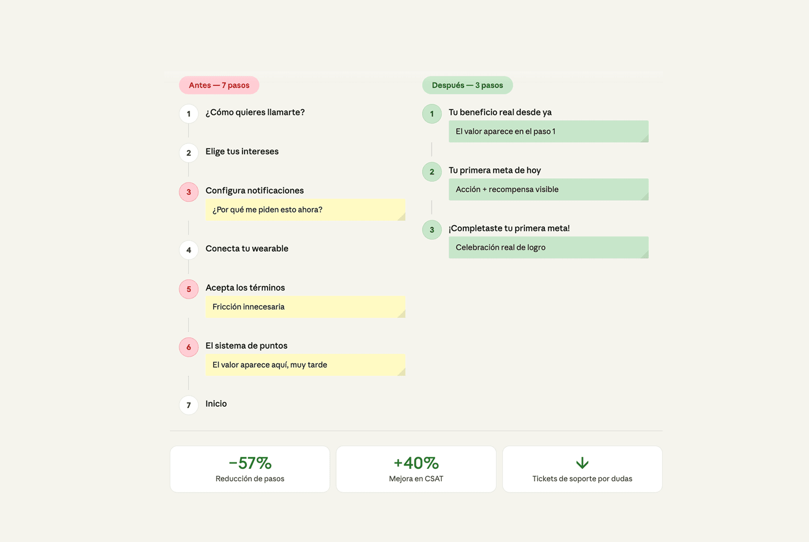
The first was redesigning the onboarding. Not to make it look better, but so that in the first three steps the user would understand exactly what they were going to gain and how. I reduced the number of screens, prioritized the value message over the explanation of features, and added a real moment of celebration when the user completed their first action.
The second was to intervene in the purchase flows. There was unnecessary friction at key points. I simplified the number of steps, made progress visible at all times, and eliminated decisions the user did not need to make at that moment.
The third was to propose navigation improvements so that the highest-value actions were accessible from any point in the app, not just from the home screen.


THE RESULTS: WHAT CHANGED AND IN HOW MUCH TIME
CSAT rose 40% in the months following implementation. It wasn’t magic or luck. It was a direct result of having diagnosed the right problem before designing any solution.
Support time related to usage questions also decreased. When the product explains itself, users don’t need to ask how it works.
WHAT I WOULDN’T DO AGAIN: THE HONEST PART
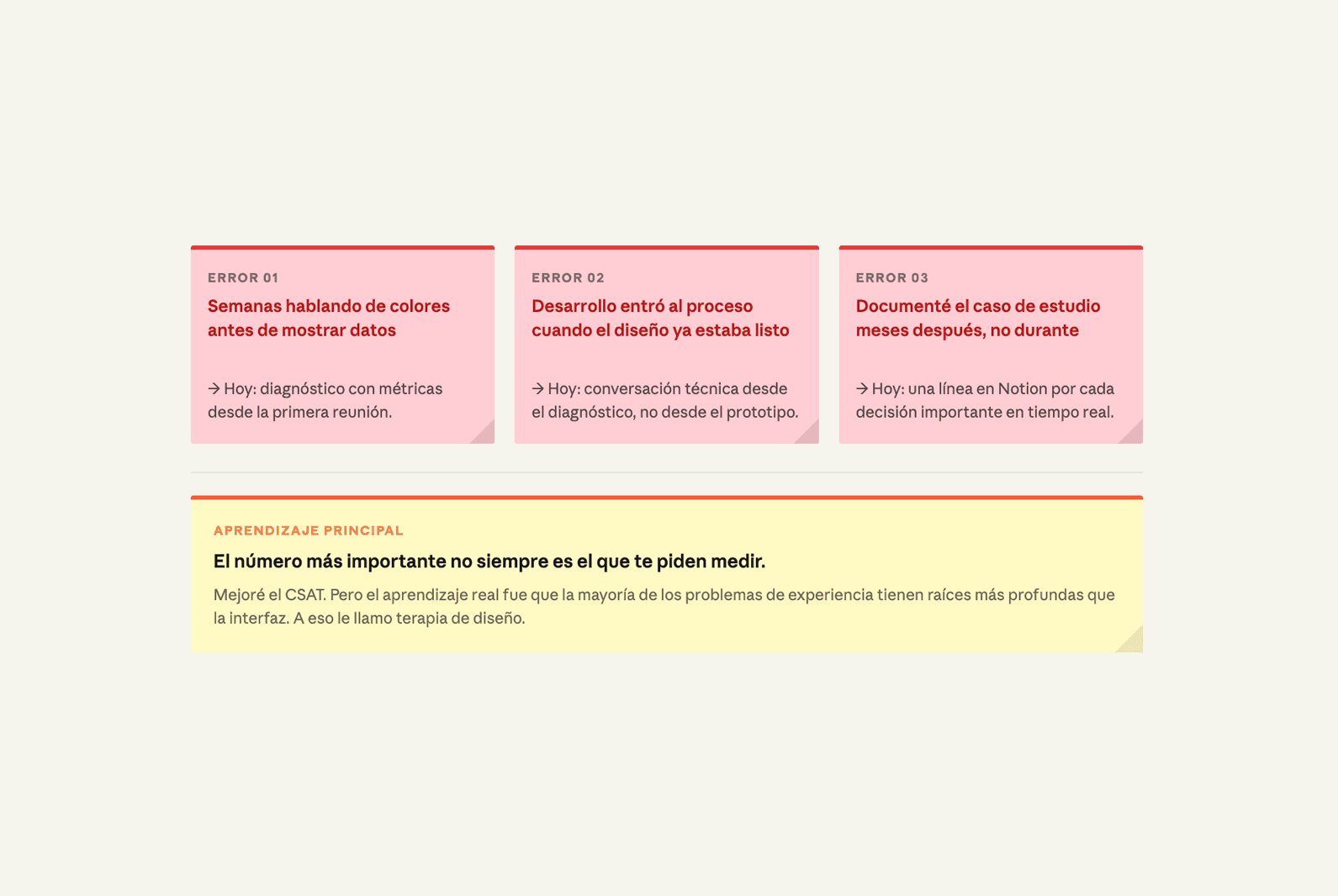
It took me too long to convince the team that the problem wasn’t visual. I lost weeks in conversations about colors and typography when the real problem was structural. Today I would solve it faster because I learned to present the diagnosis with data from day one, not afterward.
I also would have involved development much earlier in the process. Some design decisions I made were technically expensive and I had to simplify them later. The handoff would have been cleaner if the conversation had started earlier.
And I would have documented the process better in real time. Reconstructing the case study months later always loses nuances that seemed obvious at the time.
WHAT I TOOK AWAY FROM THIS PROJECT
The most important number is not always the one you’re asked to measure. They asked me to improve CSAT and I did, but the real lesson was that most experience problems have deeper roots than the interface. Designing screens better is not always the answer. Sometimes the answer is asking the right questions before designing anything.
That’s what I call design therapy.
More to discover


How I improved Betterfly's CSAT by 40%: what I did and what I wouldn't do again
This is not a perfect case study. It’s a real one, with tough decisions, honest lessons, and a result that was measured in numbers. If you’re designing for a wellness app with demanding users, some of this will sound familiar.
Process
THE CONTEXT: WHAT BETTERFLY WAS AND WHAT WAS FAILING
Betterfly is a corporate wellness platform that combines benefits, insurance, and donations in a single app. When I joined, the product already had active users, but CSAT was stagnant. People used the app, but they weren’t satisfied with the experience.
The first symptom they gave me was vague: "users don’t understand how it works." That’s not a problem; it’s a description of a symptom. My job was to find what was causing it.
THE DIAGNOSIS: WHAT I FOUND BEFORE DESIGNING ANYTHING
Before touching a single screen, I did three things. I reviewed the usage metrics to understand where people were dropping off. I read the support tickets from the last three months to understand what questions they were asking. And I spoke with real users, not with the team, but with people who used the app in their day-to-day lives.
What I found was not an interface problem. It was a problem of communicating value. Users did not understand what they gained from each action within the app. The rewards system existed, but it was neither visible nor understandable at the right moment.
The real problem was not the visual design. It was the information architecture and the moment when things were communicated.
WHAT I DID: THE DECISIONS THAT MOVED THE NUMBER
With that clear diagnosis, I worked on three fronts at the same time.
The first was redesigning the onboarding. Not to make it look better, but so that in the first three steps the user would understand exactly what they were going to gain and how. I reduced the number of screens, prioritized the value message over the explanation of features, and added a real moment of celebration when the user completed their first action.
The second was to intervene in the purchase flows. There was unnecessary friction at key points. I simplified the number of steps, made progress visible at all times, and eliminated decisions the user did not need to make at that moment.
The third was to propose navigation improvements so that the highest-value actions were accessible from any point in the app, not just from the home screen.
THE RESULTS: WHAT CHANGED AND IN HOW MUCH TIME
CSAT rose 40% in the months following implementation. It wasn’t magic or luck. It was a direct result of having diagnosed the right problem before designing any solution.
Support time related to usage questions also decreased. When the product explains itself, users don’t need to ask how it works.
WHAT I WOULDN’T DO AGAIN: THE HONEST PART
It took me too long to convince the team that the problem wasn’t visual. I lost weeks in conversations about colors and typography when the real problem was structural. Today I would solve it faster because I learned to present the diagnosis with data from day one, not afterward.
I also would have involved development much earlier in the process. Some design decisions I made were technically expensive and I had to simplify them later. The handoff would have been cleaner if the conversation had started earlier.
And I would have documented the process better in real time. Reconstructing the case study months later always loses nuances that seemed obvious at the time.
WHAT I TOOK AWAY FROM THIS PROJECT
The most important number is not always the one you’re asked to measure. They asked me to improve CSAT and I did, but the real lesson was that most experience problems have deeper roots than the interface. Designing screens better is not always the answer. Sometimes the answer is asking the right questions before designing anything.
That’s what I call design therapy.
More to discover
How I improved Betterfly's CSAT by 40%: what I did and what I wouldn't do again
This is not a perfect case study. It’s a real one, with tough decisions, honest lessons, and a result that was measured in numbers. If you’re designing for a wellness app with demanding users, some of this will sound familiar.
Process
THE CONTEXT: WHAT BETTERFLY WAS AND WHAT WAS FAILING
Betterfly is a corporate wellness platform that combines benefits, insurance, and donations in a single app. When I joined, the product already had active users, but CSAT was stagnant. People used the app, but they weren’t satisfied with the experience.
The first symptom they gave me was vague: "users don’t understand how it works." That’s not a problem; it’s a description of a symptom. My job was to find what was causing it.
THE DIAGNOSIS: WHAT I FOUND BEFORE DESIGNING ANYTHING
Before touching a single screen, I did three things. I reviewed the usage metrics to understand where people were dropping off. I read the support tickets from the last three months to understand what questions they were asking. And I spoke with real users, not with the team, but with people who used the app in their day-to-day lives.
What I found was not an interface problem. It was a problem of communicating value. Users did not understand what they gained from each action within the app. The rewards system existed, but it was neither visible nor understandable at the right moment.
The real problem was not the visual design. It was the information architecture and the moment when things were communicated.
WHAT I DID: THE DECISIONS THAT MOVED THE NUMBER
With that clear diagnosis, I worked on three fronts at the same time.
The first was redesigning the onboarding. Not to make it look better, but so that in the first three steps the user would understand exactly what they were going to gain and how. I reduced the number of screens, prioritized the value message over the explanation of features, and added a real moment of celebration when the user completed their first action.
The second was to intervene in the purchase flows. There was unnecessary friction at key points. I simplified the number of steps, made progress visible at all times, and eliminated decisions the user did not need to make at that moment.
The third was to propose navigation improvements so that the highest-value actions were accessible from any point in the app, not just from the home screen.
THE RESULTS: WHAT CHANGED AND IN HOW MUCH TIME
CSAT rose 40% in the months following implementation. It wasn’t magic or luck. It was a direct result of having diagnosed the right problem before designing any solution.
Support time related to usage questions also decreased. When the product explains itself, users don’t need to ask how it works.
WHAT I WOULDN’T DO AGAIN: THE HONEST PART
It took me too long to convince the team that the problem wasn’t visual. I lost weeks in conversations about colors and typography when the real problem was structural. Today I would solve it faster because I learned to present the diagnosis with data from day one, not afterward.
I also would have involved development much earlier in the process. Some design decisions I made were technically expensive and I had to simplify them later. The handoff would have been cleaner if the conversation had started earlier.
And I would have documented the process better in real time. Reconstructing the case study months later always loses nuances that seemed obvious at the time.
WHAT I TOOK AWAY FROM THIS PROJECT
The most important number is not always the one you’re asked to measure. They asked me to improve CSAT and I did, but the real lesson was that most experience problems have deeper roots than the interface. Designing screens better is not always the answer. Sometimes the answer is asking the right questions before designing anything.
That’s what I call design therapy.