Design System
Minerva: the design system that unified Banco de Chile
How I built components and documentation for the design system that brought visual consistency to all the digital products of one of Chile's largest banks.
Year:
2023
Industry :
Banking — Fintech
Client:
Bank of Chile
Role :
Design System Designer

Context
Banco de Chile is not a single digital product. It is an ecosystem: the personal app, web banking, investment products, insurance, the business portal, and internal tools for teams. Each of those products had grown independently, with different teams, different criteria, and component libraries that did not communicate with one another.
The result was what is known as visual fragmentation: the same button with three different sizes depending on the product, inconsistent typography, colors that varied between screens, and an experience that did not feel like the same brand. For a bank, that is not just an aesthetic problem. It is a trust problem.
Minerva was born to solve that: a single system that all products could consume, without losing the flexibility each team needed.
I was part of the Product Design team responsible for building and documenting components within Minerva. My work was both technical and editorial: not only creating the components in Figma, but also ensuring that any designer at the bank could understand them, use them correctly, and adopt them without friction.
The ecosystem that needed to be unified
Minerva had to work for products with very different needs. That meant designing components flexible enough to adapt to each context without breaking brand consistency.
📱 Personal app Mobile banking iOS and Android. High user volume, critical transactional flows. | 💻 Web banking Desktop portal for complex operations. Tables, forms, and dense dashboards. |
|---|---|
🚀 Business portal Management of corporate accounts. Expert users with needs different from retail customers. | 💰 Investments and insurance Specialized financial products with language and flows specific to the sector. |
🔧 Internal tools Products used by bank executives and teams. Same library, different context. | 🎢 Digital onboarding Account opening flows and onboarding of new customers into the ecosystem. |

The problem
Visual fragmentation across products. Each team had built its own components independently. The same visual element had up to three different versions depending on the product where it appeared. |
|---|
No usage documentation. Existing components had no clear guidance on when to use them, how to combine them, or what variants existed. Each designer made their own decisions, accumulating design debt. |
Friction between design and development. Without a shared source of truth, the handoffs were slow and full of questions. Development reimplemented components that already existed because there was no way to know what was available. |
Scalability blocked. Every time a new product needed a component, it created it from scratch. There was no way to reliably reuse previous work. |
Results
+35%Reduction in design time per sprint | −30%Development implementation time | +85%System adoption across internal teams | −12%Visual inconsistencies in audits |
|---|
My role within the system
I worked as part of Minerva's core team. My contribution focused on two fronts: building components in Figma and usage documentation for the teams that would consume the system.
Building for a design system is different from designing for a product. Every decision has consequences for multiple teams and products. A poorly documented component creates questions for ten teams at the same time. An unnecessary variant multiplies design debt at scale. That responsibility completely changes how you think about each element.
In a DS, you design for designers. Your user is the team that will consume the system, not the bank's end customer.
My process
Auditoría de interfaces existentes
Antes de crear ningún componente nuevo, auditamos las 70+ pantallas digitales del banco para mapear qué elementos existían, cuántas versiones tenían y cuáles eran los más usados. Esa auditoría definió la prioridad de construcción: primero los componentes de mayor frecuencia y mayor inconsistencia.
Definición de tokens de diseño
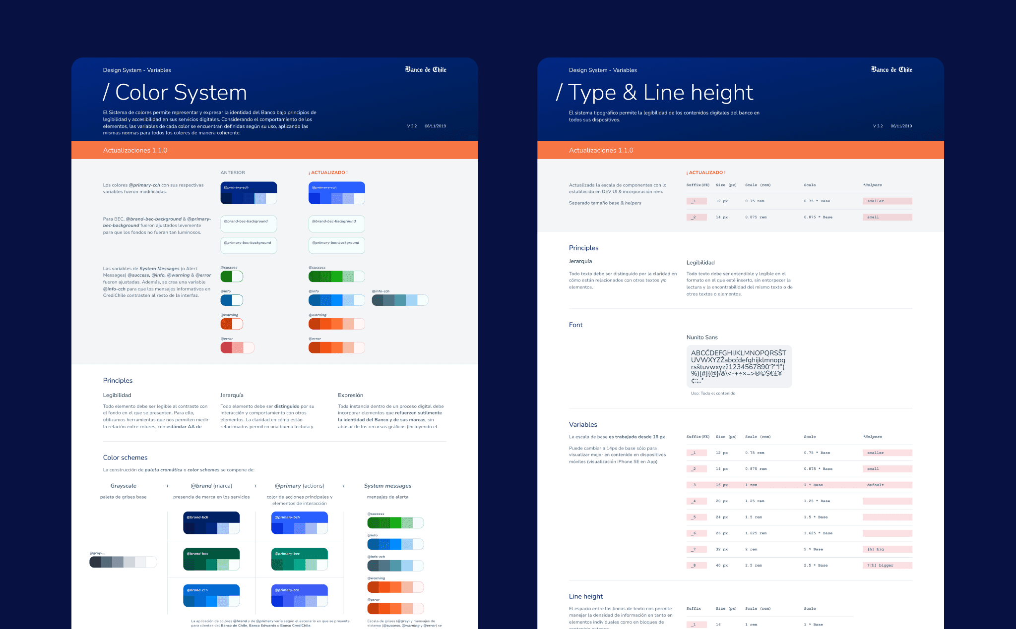
textLos tokens fueron la base de todo. Definí los valores primitivos del sistema: paleta de colores completa con semántica clara (brand, feedback, neutral, surface), escala tipográfica, espaciado, radio de bordes y sombras. Cada token tenía un nombre con significado funcional, no solo descriptivo. No "azul-500" sino "color-action-primary"
Construcción de componentes en Figma
Construí los componentes atómicos y moleculares del sistema: formularios, botones, cards, alertas, tablas, inputs, modales, tooltips, navegación y más. Cada componente tenía variantes construidas con Auto Layout, propiedades de componente para controlar estados (default, hover, focus, error, disabled) y estructura interna consistente para facilitar el handoff a desarrollo.
Documentación de uso y guidelines
Cada componente tenía su página de documentación: cuándo usarlo, cuándo no usarlo, qué variante elegir según el contexto, ejemplos de uso correcto e incorrecto, y notas de accesibilidad. La documentación la escribí pensando en el diseñador que llega nuevo al banco y necesita entender el sistema sin que nadie le explique.
Validación con equipos de producto
Antes de publicar cada componente, lo validamos con los equipos de producto que lo iban a usar. Eso reveló casos de uso que no habíamos anticipado y evitó que el sistema se volviera académico: bien documentado pero difícil de aplicar en contextos reales. Las sesiones de feedback con los equipos fueron parte formal del proceso de entrega.
Estrategia de adopción
Un design system que nadie usa no sirve. Trabajamos con los equipos para facilitar la migración desde sus librerías propias a Minerva. Hicimos sesiones de onboarding, creamos plantillas de arranque para proyectos nuevos y establecimos un proceso de contribución para que los equipos pudieran proponer nuevos componentes al sistema de forma ordenada.


Components I built
The system covered everything from atomic elements to complex interaction patterns. These are some of the components I built and documented directly.
Buttons Atom — 6 variants | Text Fields Atom — Extended set | Color System Token — Full palette |
|---|---|---|
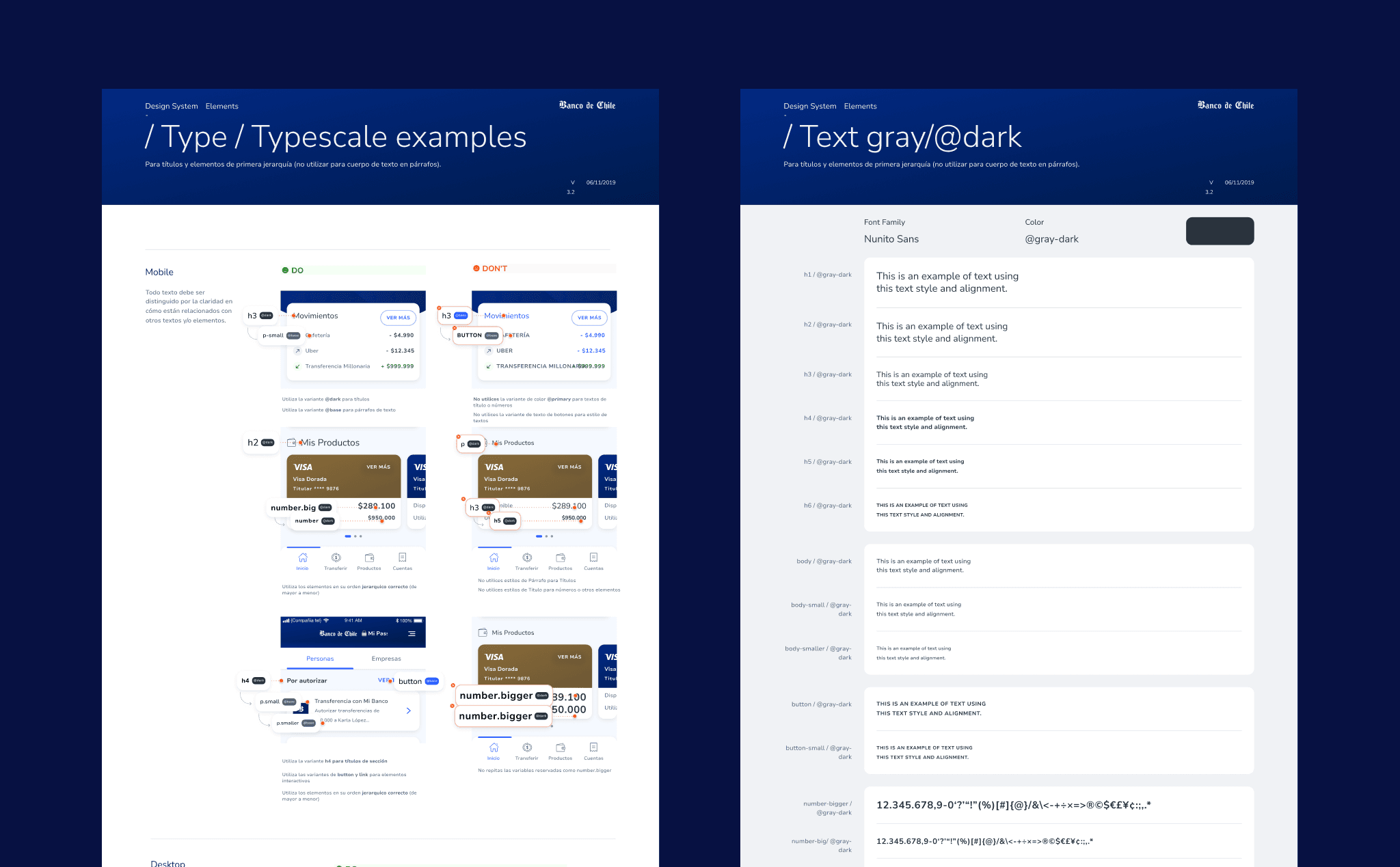
Typography Token — Type & line height | Cards Molecule — Multiple layouts | Alerts & Feedback Molecule — 4 states |
Navigation Organism — Web and mobile | Modals Organism — Confirmation and flows | Data Tables Organism — Corporate portal |
Forms Pattern — Validation and states | Tooltips Atom — 8 positions | Checkboxes & Radios Atom — Accessible |
The token architecture
Brand colors | Feedback and states |
|---|---|
--color-brand-primary: #001e62; --color-brand-accent: #cc0000; --color-action-primary: #004a99; --color-surface-secondary: #e8ecf5; --color-brand-primary: #001e62; --color-brand-accent: #cc0000; --color-action-primary: #004a99; --color-surface-secondary: #e8ecf5; --color-brand-primary: #001e62; --color-brand-accent: #cc0000; --color-action-primary: #004a99; --color-surface-secondary: #e8ecf5; | --color-feedback-success: #1a7a3e; --color-feedback-error: #cc0000; --color-feedback-warning: #b45c00; --color-feedback-info: #004a99; --color-feedback-success: #1a7a3e; --color-feedback-error: #cc0000; --color-feedback-warning: #b45c00; --color-feedback-info: #004a99; --color-feedback-success: #1a7a3e; --color-feedback-error: #cc0000; --color-feedback-warning: #b45c00; --color-feedback-info: #004a99; |
Key decisions
The most important decision was to establish the principle of "closed but extensible" components. Each component had a fixed set of official variants, but included slots and properties that allowed controlled adaptations. That resolved the tension between consistency and flexibility that constantly arose when product teams felt the system was too rigid for their use cases.
The second decision was to prioritize documentation as a first-class product, not as a closing task. Each component was not considered delivered until its documentation was complete. That initially generated resistance because it slowed delivery pace, but it was what made adoption work.
A component without documentation is a component nobody will use correctly. Documentation was not the system manual: it was part of the system.
We also defined a formal contribution process so product teams could propose new components. Without that process, each team would decide to create its own components when it could not find what it needed in the system, bringing back the original problem of fragmentation.
Tools and methodology
Figma | Auto Layout | Component Properties |
|---|---|---|
Design Tokens | Figma Variables | Figma Libraries |
Storybook | Zeroheight | WCAG Accessibility |
Design Critique | Atomic Design | Confluence |
Learnings
You design for designersIn a DS, your user is not the bank customer. It's the designer who will use your component. Thinking about that person completely changed how I made decisions about naming, structure, and documentation. | Adoption is a design problemHaving the best components doesn't guarantee that teams will use them. Adoption requires onboarding, templates, support sessions, and a contribution process that makes teams feel like part of the system. |
|---|---|
Tokens are the most cost-effective investmentA well-thought-out token architecture from the start saves weeks of work when the system scales. Changing a brand color in a token updates all components automatically. | Scaling requires governanceWithout a clear contribution and approval process, a DS fragments from within. Governance wasn't bureaucracy: it was what kept the system coherent as it grew. |

More projects


Design System
Minerva: the design system that unified Banco de Chile
How I built components and documentation for the design system that brought visual consistency to all the digital products of one of Chile's largest banks.
Year:
2023
Industry :
Banking — Fintech
Client:
Bank of Chile
Role :
Design System Designer
Context
Banco de Chile is not a single digital product. It is an ecosystem: the personal app, web banking, investment products, insurance, the business portal, and internal tools for teams. Each of those products had grown independently, with different teams, different criteria, and component libraries that did not communicate with one another.
The result was what is known as visual fragmentation: the same button with three different sizes depending on the product, inconsistent typography, colors that varied between screens, and an experience that did not feel like the same brand. For a bank, that is not just an aesthetic problem. It is a trust problem.
Minerva was born to solve that: a single system that all products could consume, without losing the flexibility each team needed.
I was part of the Product Design team responsible for building and documenting components within Minerva. My work was both technical and editorial: not only creating the components in Figma, but also ensuring that any designer at the bank could understand them, use them correctly, and adopt them without friction.
The ecosystem that needed to be unified
Minerva had to work for products with very different needs. That meant designing components flexible enough to adapt to each context without breaking brand consistency.
📱 Personal app Mobile banking iOS and Android. High user volume, critical transactional flows. | 💻 Web banking Desktop portal for complex operations. Tables, forms, and dense dashboards. |
|---|---|
🚀 Business portal Management of corporate accounts. Expert users with needs different from retail customers. | 💰 Investments and insurance Specialized financial products with language and flows specific to the sector. |
🔧 Internal tools Products used by bank executives and teams. Same library, different context. | 🎢 Digital onboarding Account opening flows and onboarding of new customers into the ecosystem. |
The problem
Visual fragmentation across products. Each team had built its own components independently. The same visual element had up to three different versions depending on the product where it appeared. |
|---|
No usage documentation. Existing components had no clear guidance on when to use them, how to combine them, or what variants existed. Each designer made their own decisions, accumulating design debt. |
Friction between design and development. Without a shared source of truth, the handoffs were slow and full of questions. Development reimplemented components that already existed because there was no way to know what was available. |
Scalability blocked. Every time a new product needed a component, it created it from scratch. There was no way to reliably reuse previous work. |
Results
+35%Reduction in design time per sprint | −30%Development implementation time | +85%System adoption across internal teams | −12%Visual inconsistencies in audits |
|---|
My role within the system
I worked as part of Minerva's core team. My contribution focused on two fronts: building components in Figma and usage documentation for the teams that would consume the system.
Building for a design system is different from designing for a product. Every decision has consequences for multiple teams and products. A poorly documented component creates questions for ten teams at the same time. An unnecessary variant multiplies design debt at scale. That responsibility completely changes how you think about each element.
In a DS, you design for designers. Your user is the team that will consume the system, not the bank's end customer.
My process
Auditoría de interfaces existentes
Antes de crear ningún componente nuevo, auditamos las 70+ pantallas digitales del banco para mapear qué elementos existían, cuántas versiones tenían y cuáles eran los más usados. Esa auditoría definió la prioridad de construcción: primero los componentes de mayor frecuencia y mayor inconsistencia.
Definición de tokens de diseño
textLos tokens fueron la base de todo. Definí los valores primitivos del sistema: paleta de colores completa con semántica clara (brand, feedback, neutral, surface), escala tipográfica, espaciado, radio de bordes y sombras. Cada token tenía un nombre con significado funcional, no solo descriptivo. No "azul-500" sino "color-action-primary"
Construcción de componentes en Figma
Construí los componentes atómicos y moleculares del sistema: formularios, botones, cards, alertas, tablas, inputs, modales, tooltips, navegación y más. Cada componente tenía variantes construidas con Auto Layout, propiedades de componente para controlar estados (default, hover, focus, error, disabled) y estructura interna consistente para facilitar el handoff a desarrollo.
Documentación de uso y guidelines
Cada componente tenía su página de documentación: cuándo usarlo, cuándo no usarlo, qué variante elegir según el contexto, ejemplos de uso correcto e incorrecto, y notas de accesibilidad. La documentación la escribí pensando en el diseñador que llega nuevo al banco y necesita entender el sistema sin que nadie le explique.
Validación con equipos de producto
Antes de publicar cada componente, lo validamos con los equipos de producto que lo iban a usar. Eso reveló casos de uso que no habíamos anticipado y evitó que el sistema se volviera académico: bien documentado pero difícil de aplicar en contextos reales. Las sesiones de feedback con los equipos fueron parte formal del proceso de entrega.
Estrategia de adopción
Un design system que nadie usa no sirve. Trabajamos con los equipos para facilitar la migración desde sus librerías propias a Minerva. Hicimos sesiones de onboarding, creamos plantillas de arranque para proyectos nuevos y establecimos un proceso de contribución para que los equipos pudieran proponer nuevos componentes al sistema de forma ordenada.
Components I built
The system covered everything from atomic elements to complex interaction patterns. These are some of the components I built and documented directly.
Buttons Atom — 6 variants | Text Fields Atom — Extended set | Color System Token — Full palette |
|---|---|---|
Typography Token — Type & line height | Cards Molecule — Multiple layouts | Alerts & Feedback Molecule — 4 states |
Navigation Organism — Web and mobile | Modals Organism — Confirmation and flows | Data Tables Organism — Corporate portal |
Forms Pattern — Validation and states | Tooltips Atom — 8 positions | Checkboxes & Radios Atom — Accessible |
The token architecture
Brand colors | Feedback and states |
|---|---|
--color-brand-primary: #001e62; --color-brand-accent: #cc0000; --color-action-primary: #004a99; --color-surface-secondary: #e8ecf5; --color-brand-primary: #001e62; --color-brand-accent: #cc0000; --color-action-primary: #004a99; --color-surface-secondary: #e8ecf5; --color-brand-primary: #001e62; --color-brand-accent: #cc0000; --color-action-primary: #004a99; --color-surface-secondary: #e8ecf5; | --color-feedback-success: #1a7a3e; --color-feedback-error: #cc0000; --color-feedback-warning: #b45c00; --color-feedback-info: #004a99; --color-feedback-success: #1a7a3e; --color-feedback-error: #cc0000; --color-feedback-warning: #b45c00; --color-feedback-info: #004a99; --color-feedback-success: #1a7a3e; --color-feedback-error: #cc0000; --color-feedback-warning: #b45c00; --color-feedback-info: #004a99; |
Key decisions
The most important decision was to establish the principle of "closed but extensible" components. Each component had a fixed set of official variants, but included slots and properties that allowed controlled adaptations. That resolved the tension between consistency and flexibility that constantly arose when product teams felt the system was too rigid for their use cases.
The second decision was to prioritize documentation as a first-class product, not as a closing task. Each component was not considered delivered until its documentation was complete. That initially generated resistance because it slowed delivery pace, but it was what made adoption work.
A component without documentation is a component nobody will use correctly. Documentation was not the system manual: it was part of the system.
We also defined a formal contribution process so product teams could propose new components. Without that process, each team would decide to create its own components when it could not find what it needed in the system, bringing back the original problem of fragmentation.
Tools and methodology
Figma | Auto Layout | Component Properties |
|---|---|---|
Design Tokens | Figma Variables | Figma Libraries |
Storybook | Zeroheight | WCAG Accessibility |
Design Critique | Atomic Design | Confluence |
Learnings
You design for designersIn a DS, your user is not the bank customer. It's the designer who will use your component. Thinking about that person completely changed how I made decisions about naming, structure, and documentation. | Adoption is a design problemHaving the best components doesn't guarantee that teams will use them. Adoption requires onboarding, templates, support sessions, and a contribution process that makes teams feel like part of the system. |
|---|---|
Tokens are the most cost-effective investmentA well-thought-out token architecture from the start saves weeks of work when the system scales. Changing a brand color in a token updates all components automatically. | Scaling requires governanceWithout a clear contribution and approval process, a DS fragments from within. Governance wasn't bureaucracy: it was what kept the system coherent as it grew. |
More projects
Design System
Minerva: the design system that unified Banco de Chile
How I built components and documentation for the design system that brought visual consistency to all the digital products of one of Chile's largest banks.
Year:
2023
Industry :
Banking — Fintech
Client:
Bank of Chile
Role :
Design System Designer
Context
Banco de Chile is not a single digital product. It is an ecosystem: the personal app, web banking, investment products, insurance, the business portal, and internal tools for teams. Each of those products had grown independently, with different teams, different criteria, and component libraries that did not communicate with one another.
The result was what is known as visual fragmentation: the same button with three different sizes depending on the product, inconsistent typography, colors that varied between screens, and an experience that did not feel like the same brand. For a bank, that is not just an aesthetic problem. It is a trust problem.
Minerva was born to solve that: a single system that all products could consume, without losing the flexibility each team needed.
I was part of the Product Design team responsible for building and documenting components within Minerva. My work was both technical and editorial: not only creating the components in Figma, but also ensuring that any designer at the bank could understand them, use them correctly, and adopt them without friction.
The ecosystem that needed to be unified
Minerva had to work for products with very different needs. That meant designing components flexible enough to adapt to each context without breaking brand consistency.
📱 Personal app Mobile banking iOS and Android. High user volume, critical transactional flows. | 💻 Web banking Desktop portal for complex operations. Tables, forms, and dense dashboards. |
|---|---|
🚀 Business portal Management of corporate accounts. Expert users with needs different from retail customers. | 💰 Investments and insurance Specialized financial products with language and flows specific to the sector. |
🔧 Internal tools Products used by bank executives and teams. Same library, different context. | 🎢 Digital onboarding Account opening flows and onboarding of new customers into the ecosystem. |
The problem
Visual fragmentation across products. Each team had built its own components independently. The same visual element had up to three different versions depending on the product where it appeared. |
|---|
No usage documentation. Existing components had no clear guidance on when to use them, how to combine them, or what variants existed. Each designer made their own decisions, accumulating design debt. |
Friction between design and development. Without a shared source of truth, the handoffs were slow and full of questions. Development reimplemented components that already existed because there was no way to know what was available. |
Scalability blocked. Every time a new product needed a component, it created it from scratch. There was no way to reliably reuse previous work. |
Results
+35%Reduction in design time per sprint | −30%Development implementation time | +85%System adoption across internal teams | −12%Visual inconsistencies in audits |
|---|
My role within the system
I worked as part of Minerva's core team. My contribution focused on two fronts: building components in Figma and usage documentation for the teams that would consume the system.
Building for a design system is different from designing for a product. Every decision has consequences for multiple teams and products. A poorly documented component creates questions for ten teams at the same time. An unnecessary variant multiplies design debt at scale. That responsibility completely changes how you think about each element.
In a DS, you design for designers. Your user is the team that will consume the system, not the bank's end customer.
My process
Auditoría de interfaces existentes
Antes de crear ningún componente nuevo, auditamos las 70+ pantallas digitales del banco para mapear qué elementos existían, cuántas versiones tenían y cuáles eran los más usados. Esa auditoría definió la prioridad de construcción: primero los componentes de mayor frecuencia y mayor inconsistencia.
Definición de tokens de diseño
textLos tokens fueron la base de todo. Definí los valores primitivos del sistema: paleta de colores completa con semántica clara (brand, feedback, neutral, surface), escala tipográfica, espaciado, radio de bordes y sombras. Cada token tenía un nombre con significado funcional, no solo descriptivo. No "azul-500" sino "color-action-primary"
Construcción de componentes en Figma
Construí los componentes atómicos y moleculares del sistema: formularios, botones, cards, alertas, tablas, inputs, modales, tooltips, navegación y más. Cada componente tenía variantes construidas con Auto Layout, propiedades de componente para controlar estados (default, hover, focus, error, disabled) y estructura interna consistente para facilitar el handoff a desarrollo.
Documentación de uso y guidelines
Cada componente tenía su página de documentación: cuándo usarlo, cuándo no usarlo, qué variante elegir según el contexto, ejemplos de uso correcto e incorrecto, y notas de accesibilidad. La documentación la escribí pensando en el diseñador que llega nuevo al banco y necesita entender el sistema sin que nadie le explique.
Validación con equipos de producto
Antes de publicar cada componente, lo validamos con los equipos de producto que lo iban a usar. Eso reveló casos de uso que no habíamos anticipado y evitó que el sistema se volviera académico: bien documentado pero difícil de aplicar en contextos reales. Las sesiones de feedback con los equipos fueron parte formal del proceso de entrega.
Estrategia de adopción
Un design system que nadie usa no sirve. Trabajamos con los equipos para facilitar la migración desde sus librerías propias a Minerva. Hicimos sesiones de onboarding, creamos plantillas de arranque para proyectos nuevos y establecimos un proceso de contribución para que los equipos pudieran proponer nuevos componentes al sistema de forma ordenada.
Components I built
The system covered everything from atomic elements to complex interaction patterns. These are some of the components I built and documented directly.
Buttons Atom — 6 variants | Text Fields Atom — Extended set | Color System Token — Full palette |
|---|---|---|
Typography Token — Type & line height | Cards Molecule — Multiple layouts | Alerts & Feedback Molecule — 4 states |
Navigation Organism — Web and mobile | Modals Organism — Confirmation and flows | Data Tables Organism — Corporate portal |
Forms Pattern — Validation and states | Tooltips Atom — 8 positions | Checkboxes & Radios Atom — Accessible |
The token architecture
Brand colors | Feedback and states |
|---|---|
--color-brand-primary: #001e62; --color-brand-accent: #cc0000; --color-action-primary: #004a99; --color-surface-secondary: #e8ecf5; --color-brand-primary: #001e62; --color-brand-accent: #cc0000; --color-action-primary: #004a99; --color-surface-secondary: #e8ecf5; --color-brand-primary: #001e62; --color-brand-accent: #cc0000; --color-action-primary: #004a99; --color-surface-secondary: #e8ecf5; | --color-feedback-success: #1a7a3e; --color-feedback-error: #cc0000; --color-feedback-warning: #b45c00; --color-feedback-info: #004a99; --color-feedback-success: #1a7a3e; --color-feedback-error: #cc0000; --color-feedback-warning: #b45c00; --color-feedback-info: #004a99; --color-feedback-success: #1a7a3e; --color-feedback-error: #cc0000; --color-feedback-warning: #b45c00; --color-feedback-info: #004a99; |
Key decisions
The most important decision was to establish the principle of "closed but extensible" components. Each component had a fixed set of official variants, but included slots and properties that allowed controlled adaptations. That resolved the tension between consistency and flexibility that constantly arose when product teams felt the system was too rigid for their use cases.
The second decision was to prioritize documentation as a first-class product, not as a closing task. Each component was not considered delivered until its documentation was complete. That initially generated resistance because it slowed delivery pace, but it was what made adoption work.
A component without documentation is a component nobody will use correctly. Documentation was not the system manual: it was part of the system.
We also defined a formal contribution process so product teams could propose new components. Without that process, each team would decide to create its own components when it could not find what it needed in the system, bringing back the original problem of fragmentation.
Tools and methodology
Figma | Auto Layout | Component Properties |
|---|---|---|
Design Tokens | Figma Variables | Figma Libraries |
Storybook | Zeroheight | WCAG Accessibility |
Design Critique | Atomic Design | Confluence |
Learnings
You design for designersIn a DS, your user is not the bank customer. It's the designer who will use your component. Thinking about that person completely changed how I made decisions about naming, structure, and documentation. | Adoption is a design problemHaving the best components doesn't guarantee that teams will use them. Adoption requires onboarding, templates, support sessions, and a contribution process that makes teams feel like part of the system. |
|---|---|
Tokens are the most cost-effective investmentA well-thought-out token architecture from the start saves weeks of work when the system scales. Changing a brand color in a token updates all components automatically. | Scaling requires governanceWithout a clear contribution and approval process, a DS fragments from within. Governance wasn't bureaucracy: it was what kept the system coherent as it grew. |