UI / UX Design
Vivo Duoc UC: redesigning an app and building the system that supports it
How I led the complete redesign of the Duoc UC app, built the product’s visual identity from scratch, and simultaneously developed the design system that would scale across all the institute’s digital products.
Year:
2025
Industry :
Higher education
Client:
DUOC UC
Role :
Lead Product Designer

Context
Duoc UC is one of the largest higher education institutes in Chile, with more than 130,000 active students across campuses throughout the country. Its mobile app was the main tool students used to manage their academic life, schedules, grades, attendance, certificates, virtual ID, and much more.
The problem was evident as soon as the app was opened. It had been built by developers without design direction, with a functional interface but without a system, identity, or user experience criteria. Each screen seemed to have been designed independently. It was an app that did what it had to do, but it did not feel like a product.
In 2024 Duoc UC decided to do a complete redesign. The condition was clear, it was not just about redesigning screens. It was about building a new identity for the institute's digital product and developing in parallel the design system that would serve as the foundation for the app, the web, and any new digital product that Duoc UC launched in the future.
It wasn't a redesign. It was building the digital visual language of an institution with 130,000 students from scratch.
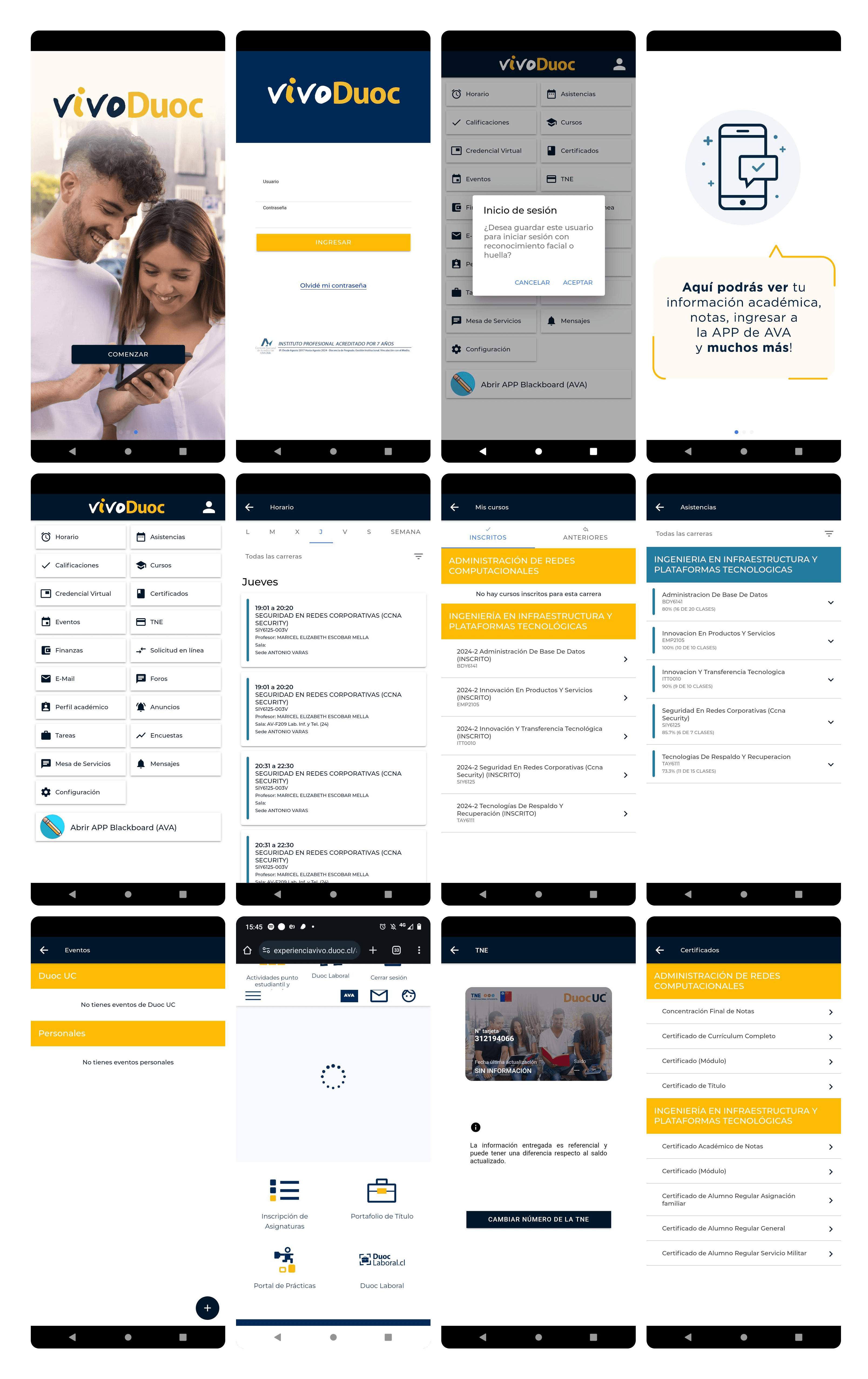
The app we had
Previous app | New VIVO App |
|---|---|
Grid navigation with icons and no hierarchy. 15 options visible at the same time without prioritization. | Bottom navigation with 5 main sections. Direct access to the most used features. |
No design system. Each screen used different colors, typography, and spacing. | Complete design system with tokens, components, and documentation. |
Mixed visual identity: institutional blue with yellow, without cohesion | New purple identity with typography and palette defined by the design team. |
Nonexistent onboarding. The user entered without knowing what they could do. | 3-step walkthrough that provides context for the main functions before login. |
Generic error states. Technical messages without context or suggested solution. | 4 types of error modals with specific messages and concrete actions. |
No bottom navigation. The main navigation was the same list of icons on the home screen. | Contextual navigation with direct access to the course from the schedule. |

Two projects in parallel
This project had a particular complexity: the app could not be designed without the system, but the system could not exist without the app that validated it. I worked on both in parallel intentionally.
🟣 Vivo Duoc UC App (Product) | 🟠 Design System (Infrastructure) |
|---|---|
Complete redesign of the mobile app. New flows, new identity, new features, and a new information architecture. The product that 130,000 students would use every day. | Component library, tokens, and documentation built in parallel. Designed to scale to the web, internal products, and any new digital tool the institute developed. |
The challenges
01 Real scale from day one. The app had to work for students from completely different degree programs: a Communication student and an Engineering student needed the same app, but used totally different functions. The design had to be flexible without being generic. |
|---|
02 A single product designer leading everything. I worked with a UI designer from an external company on the system's visual side, but I led the decisions on architecture, flows, identity, and components. That required a very organized process to avoid losing coherence. |
03 The design system had to be usable by teams that had not participated in its construction. A system only I could understand was useless. The documentation and usage criteria had to be autonomous from the start. |
04 Identity decisions without precedent. Duoc UC did not have an established digital identity for its products. The purple, the typography, the visual tone, and the personality of VIVO were decisions made by the design team, not prior brand mandates. |
05 Complex use cases. Some students had more than one active program at the same time. The attendance, courses, certificates, and requests flows had to handle that complexity without overwhelming the average user who only had one. |
Results
+50%Improvement in post-launch user satisfaction | −35%Reduction in design time per sprint with the DS |
|---|---|
4xProducts consuming the component library | 130kStudents impacted by the redesign |
My process
Audit and research with real usersI started by mapping all the flows in the existing app and identifying friction points. I conducted interviews with students from different programs and campuses to understand what they used most, what they avoided, and what they were missing. The most important finding: the most frequent users were those who had classes during the day and needed to check their schedule, attendance, and ID in less than 30 seconds. That defined the priorities for the main navigation. |
|---|
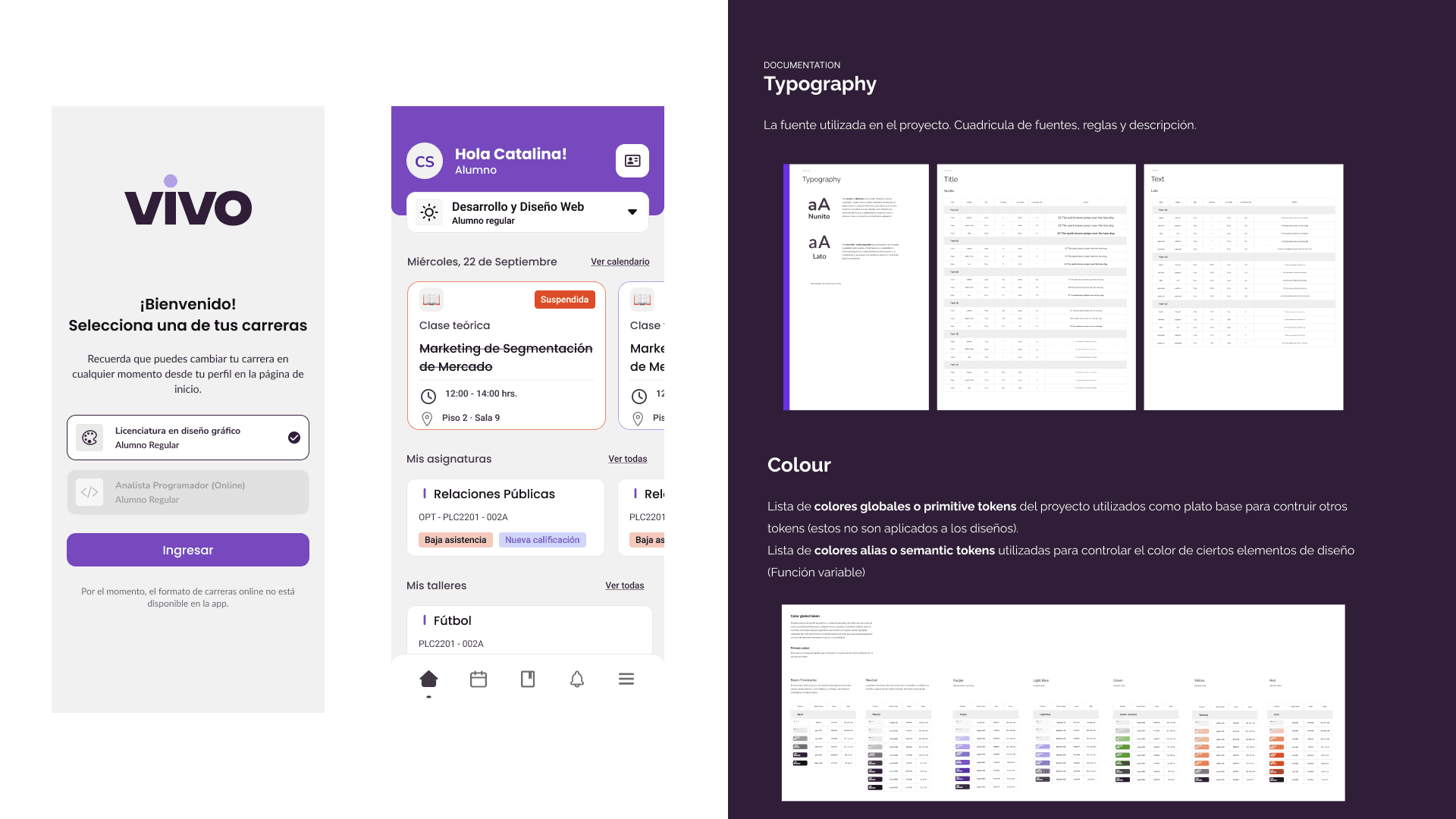
Defining identity and creative directionTogether with the team, I defined VIVO's visual identity. The choice of purple was intentional: we wanted to break away from the heavy institutional blue that associated the app with procedures and bureaucracy. Purple brought youthful energy without losing academic seriousness. I defined the full palette, typography, visual tone, and design principles that would guide all subsequent decisions. |
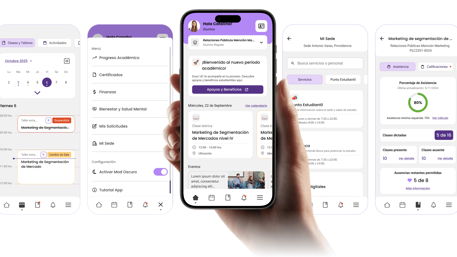
Information architecture and new navigationI redesigned the entire architecture. The 15-icon grid was replaced with a 5-tab bottom navigation: Home, Schedule, Requests, Notifications, and Profile. Less frequent functions were organized contextually within each section. That change was the most important structural decision in the project: putting the critical actions within thumb's reach without removing secondary functions. |
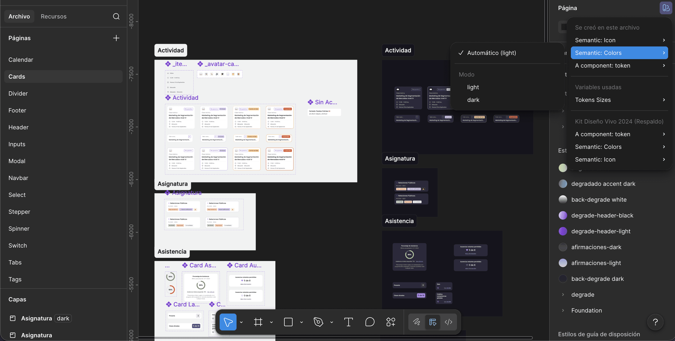
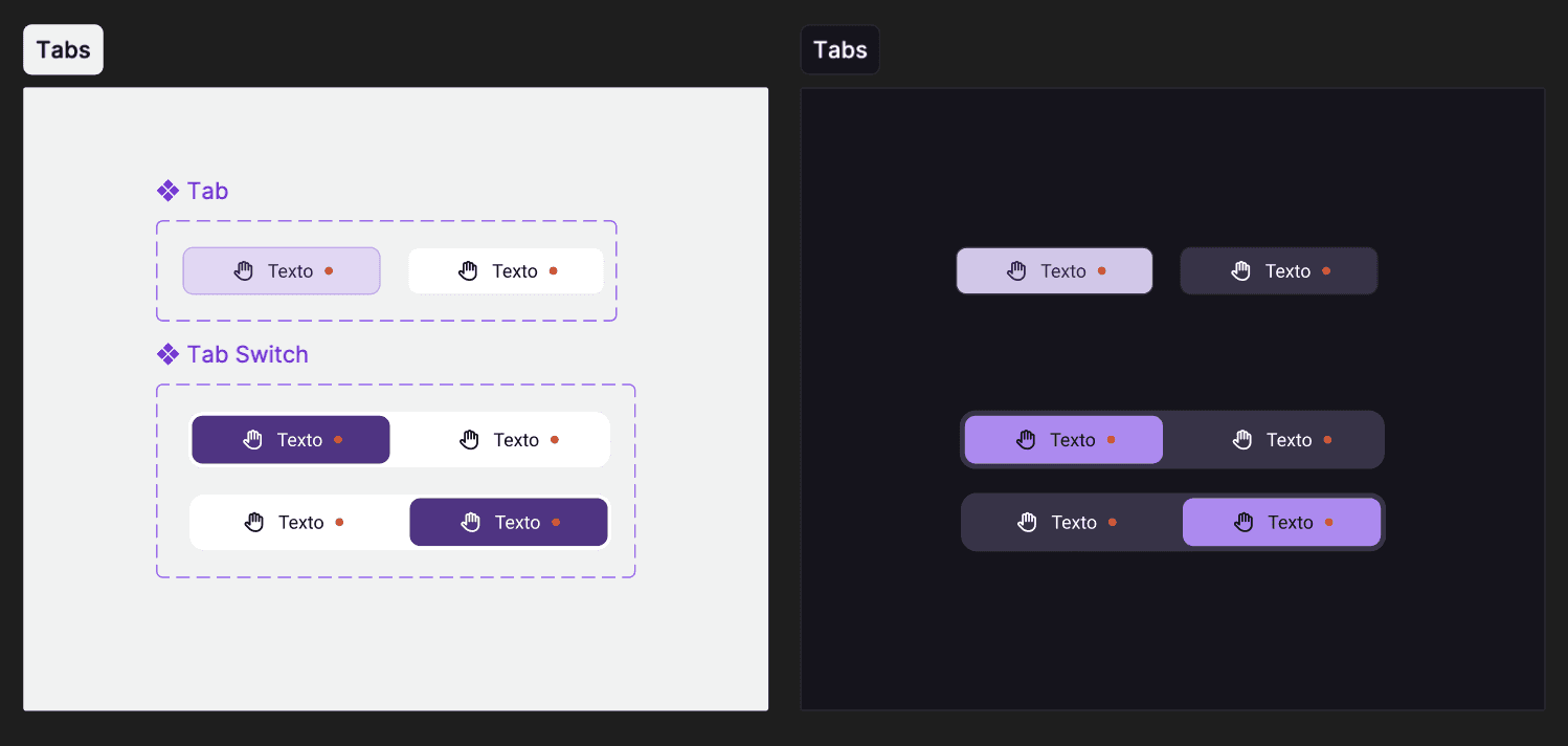
Building the Design System in parallelWhile I was designing the app flows, I was building the design system. I started with the tokens: color, typography, spacing, border radius, and shadows. Then the atomic components: buttons, inputs, cards, badges, modals. Then the patterns: how those components combine to solve concrete problems such as a request form or an activity card with multiple states. The external UI designer implemented the visual system under my criteria. 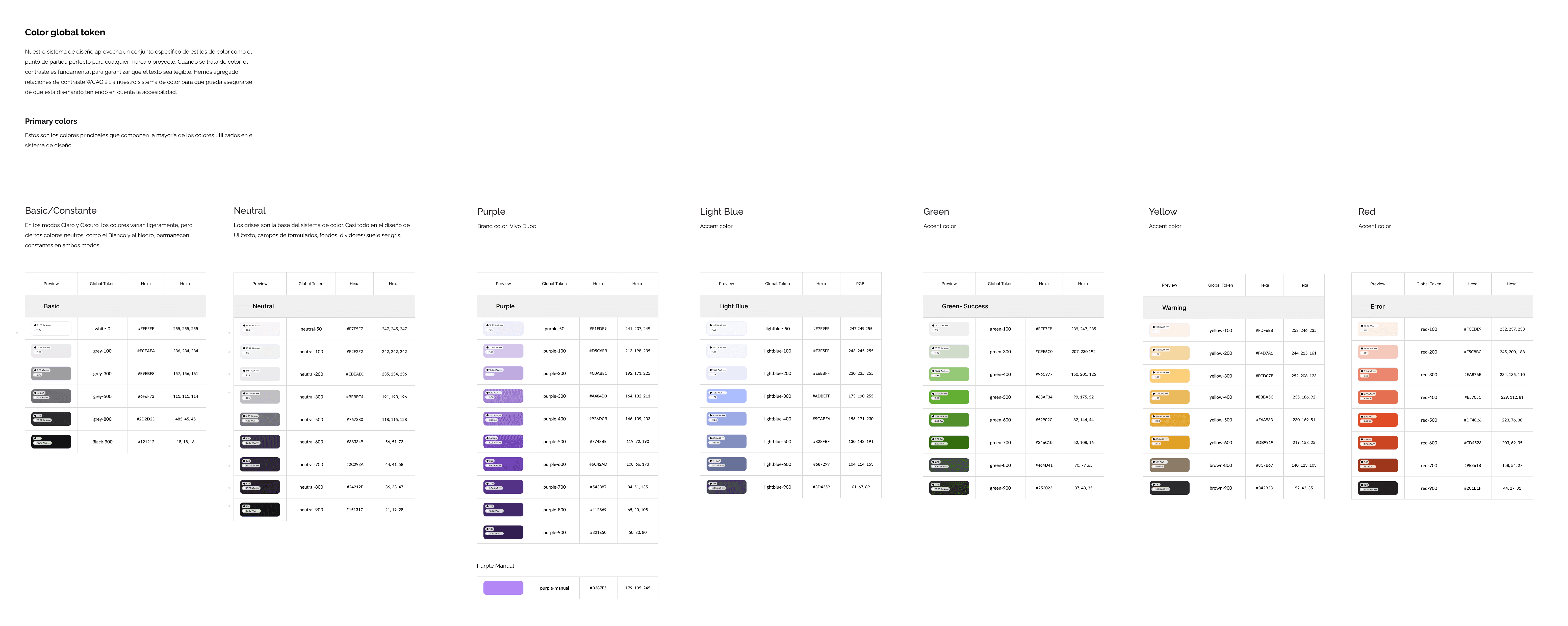 |
Designing complex flowsI designed the most complex flows in the app: academic progress with credit visualization by category, course enrollment with differentiated states (enrolled, approved, failed, supplementary), the request system with ticket tracking, and the calendar integrated with Google Calendar and the native calendar. Each flow had to handle cases of students with multiple active programs without breaking the standard user experience. 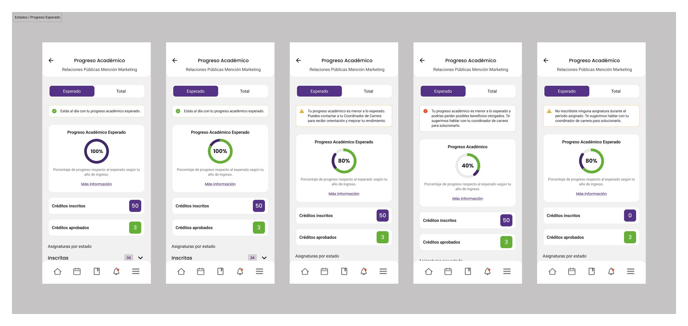 |
Error states and edge casesI dedicated specific time to error states. The previous app had a single generic error modal for everything. I designed four different types: generic error, unsupported staff profile, unavailable online program, and student removed from the system. Each one had a specific message, a concrete action, and a different tone depending on severity. That reduced friction in access issues that previously reached support without context. 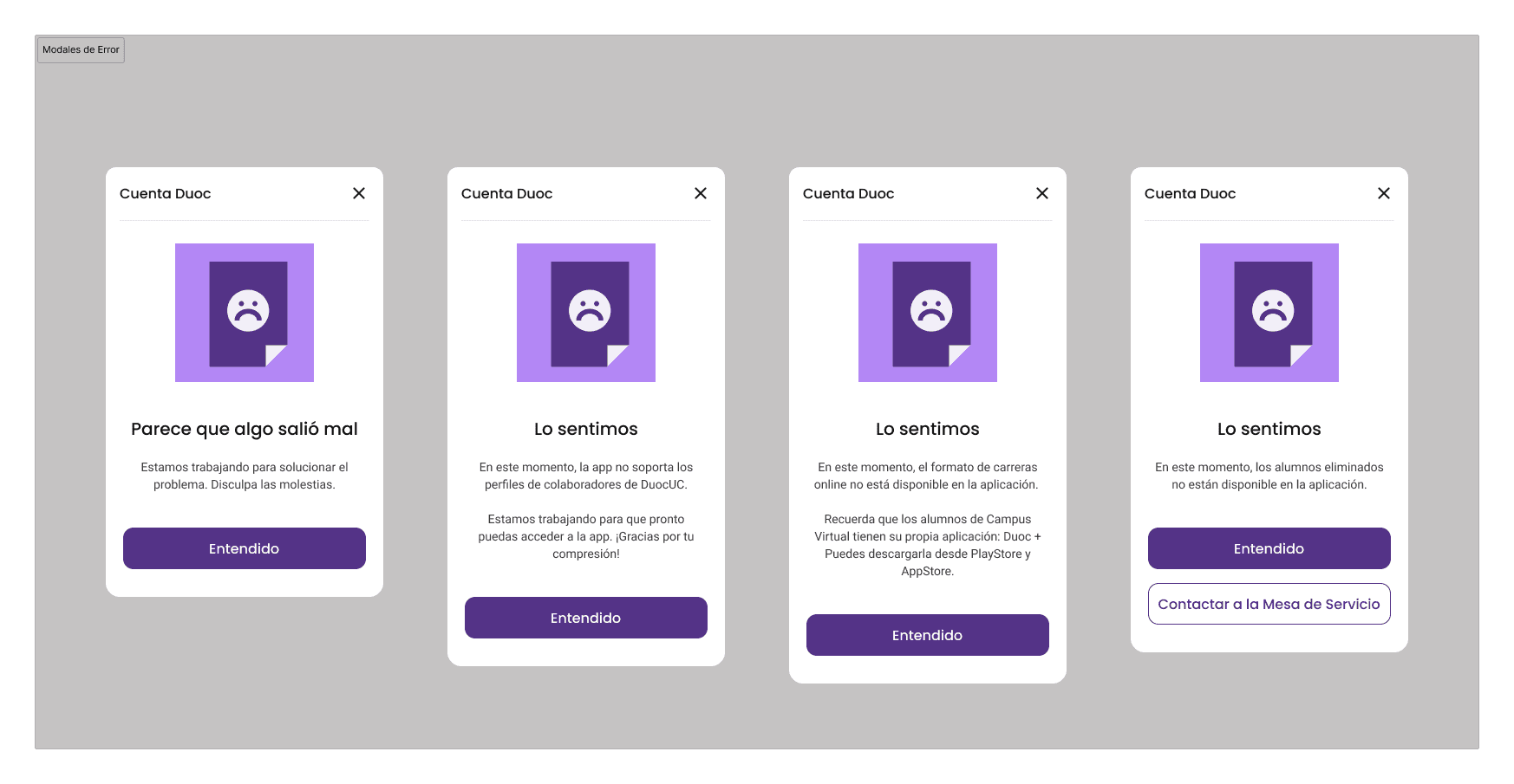 |
Walkthrough and onboardingI designed a 3-screen walkthrough that appears the first time the user opens the app. It was not a generic tutorial: each screen communicated a specific value proposition: track your academic progress, manage your time, all in one place. I also designed the maintenance state with direct access to the digital credential, so that even when the app was under maintenance, students could access their virtual ID. 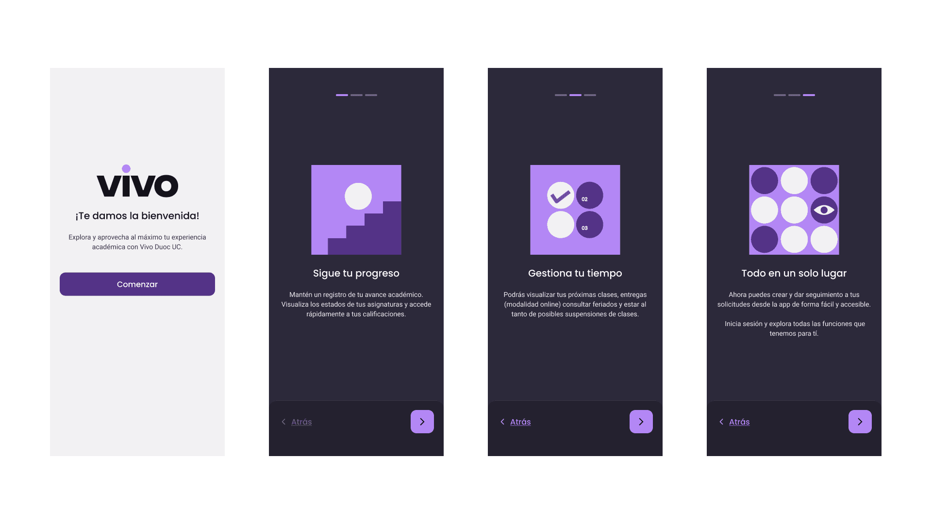 |


The design system
The design system was not a separate project: it was the infrastructure that would make the app maintainable and scalable. I built it with a three-layer logic.
01 Tokens | 02 Components | 03 Patterns |
|---|---|---|
Color, typography, spacing, radius, and shadows. The system's primitive values with semantic names. | Buttons, inputs, cards, badges, modals, navigation. Each one with documented state variants. | Combinations of components to solve complete flows: requests, calendars, forms, academic lists. |
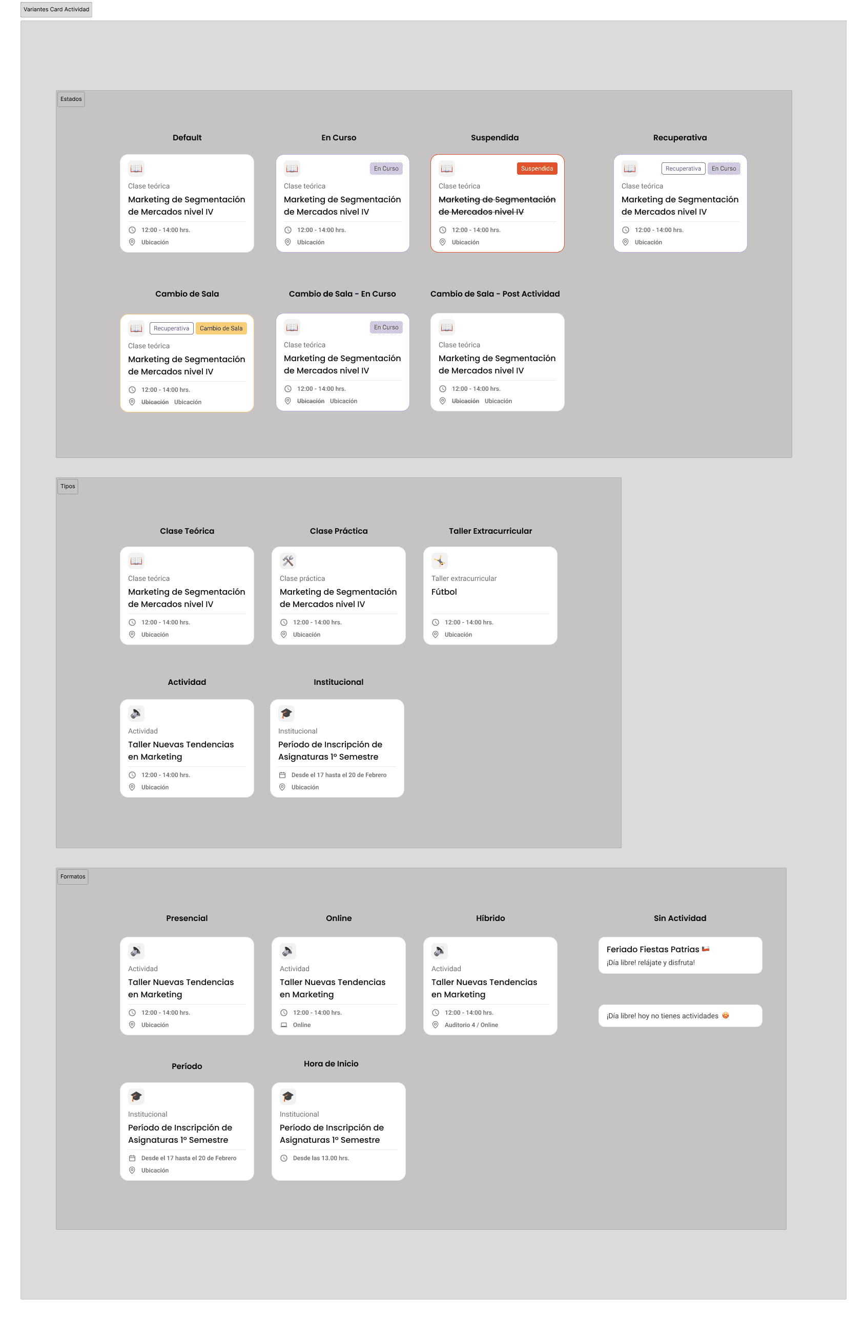
The Activity Card was one of the most complex components in the system. It had to work for 5 activity types (lecture, practice, workshop, institutional activity, holiday), 4 states (default, in progress, suspended, makeup), 3 formats (in person, online, hybrid), and room-change combinations. Designing that component so that all cases were readable without creating an explosion of variants was the system's most important technical challenge.
Designed flows and screens
Login + error states 4 specific error modals, loading state, help modal with support number and account activation option. | Calendar and schedule Weekly and monthly views, filters by category, activity detail with direct access to the course, synchronization with external calendars. |
|---|---|
Academic progress Credit visualization by category, explanatory tooltips, course-specific states, and access to the study plan. | Course enrollment Complete flow with differentiated states: enrolled, approved, failed, supplemental. Handling multiple simultaneous degree programs. |
Request system My requests with open, closed, and historical states. Ticket detail with response timeline and option to resubmit a rejected request. | Digital credential + maintenance Credential with a barcode always accessible, even during maintenance. Maintenance screen with direct access without login. |
Key design decisions
The most important decision was changing the navigation paradigm. Moving from the icon grid to bottom navigation was not just a visual change: it was a statement about what mattered. The grid treated all functions as equal. Bottom navigation said: these five things are what a student needs every day. Everything else is there, but it doesn’t compete for attention with what’s critical.
The second decision was the credential accessible during maintenance. That was not in the original brief. But during the research I discovered that many students used the credential to enter the campus. If the app was under maintenance and they couldn’t get in, the problem wasn’t technical. It was physical. That maintenance screen with access to the credential was one of the smallest decisions in the project with the greatest real impact.
The best design in the project was an error screen. The credential accessible during maintenance solved a problem that no one had named but everyone had experienced.
In the design system, the most important decision was designing for the team that wasn’t in the room. The system had to be autonomous: documented in a way that a new designer could understand it, a developer could implement it, and a product manager could use it as a reference without needing me to explain it to them.
Learnings
Product and system are inseparable You can’t build a good system without a product that validates it, nor a scalable product without a system that supports it. Working on them in parallel was the right decision, even if it was the hardest one. | Edge cases are the real design Students with two degrees, collaborators trying to enter, the app under maintenance. Those cases are not the exception. They are where design is proven or breaks. |
|---|---|
Leading without a large team Being the only product designer required a lot of judgment about what to do first, what to delegate, and what to simplify without losing quality. I learned to prioritize with more discipline than ever. | The system designs for the future The design system was not for the current app. It was so that Duoc UC could launch any new digital product without starting from scratch. That changed how I made every system decision. |

More projects


UI / UX Design
Vivo Duoc UC: redesigning an app and building the system that supports it
How I led the complete redesign of the Duoc UC app, built the product’s visual identity from scratch, and simultaneously developed the design system that would scale across all the institute’s digital products.
Year:
2025
Industry :
Higher education
Client:
DUOC UC
Role :
Lead Product Designer
Context
Duoc UC is one of the largest higher education institutes in Chile, with more than 130,000 active students across campuses throughout the country. Its mobile app was the main tool students used to manage their academic life, schedules, grades, attendance, certificates, virtual ID, and much more.
The problem was evident as soon as the app was opened. It had been built by developers without design direction, with a functional interface but without a system, identity, or user experience criteria. Each screen seemed to have been designed independently. It was an app that did what it had to do, but it did not feel like a product.
In 2024 Duoc UC decided to do a complete redesign. The condition was clear, it was not just about redesigning screens. It was about building a new identity for the institute's digital product and developing in parallel the design system that would serve as the foundation for the app, the web, and any new digital product that Duoc UC launched in the future.
It wasn't a redesign. It was building the digital visual language of an institution with 130,000 students from scratch.
The app we had
Previous app | New VIVO App |
|---|---|
Grid navigation with icons and no hierarchy. 15 options visible at the same time without prioritization. | Bottom navigation with 5 main sections. Direct access to the most used features. |
No design system. Each screen used different colors, typography, and spacing. | Complete design system with tokens, components, and documentation. |
Mixed visual identity: institutional blue with yellow, without cohesion | New purple identity with typography and palette defined by the design team. |
Nonexistent onboarding. The user entered without knowing what they could do. | 3-step walkthrough that provides context for the main functions before login. |
Generic error states. Technical messages without context or suggested solution. | 4 types of error modals with specific messages and concrete actions. |
No bottom navigation. The main navigation was the same list of icons on the home screen. | Contextual navigation with direct access to the course from the schedule. |
Two projects in parallel
This project had a particular complexity: the app could not be designed without the system, but the system could not exist without the app that validated it. I worked on both in parallel intentionally.
🟣 Vivo Duoc UC App (Product) | 🟠 Design System (Infrastructure) |
|---|---|
Complete redesign of the mobile app. New flows, new identity, new features, and a new information architecture. The product that 130,000 students would use every day. | Component library, tokens, and documentation built in parallel. Designed to scale to the web, internal products, and any new digital tool the institute developed. |
The challenges
01 Real scale from day one. The app had to work for students from completely different degree programs: a Communication student and an Engineering student needed the same app, but used totally different functions. The design had to be flexible without being generic. |
|---|
02 A single product designer leading everything. I worked with a UI designer from an external company on the system's visual side, but I led the decisions on architecture, flows, identity, and components. That required a very organized process to avoid losing coherence. |
03 The design system had to be usable by teams that had not participated in its construction. A system only I could understand was useless. The documentation and usage criteria had to be autonomous from the start. |
04 Identity decisions without precedent. Duoc UC did not have an established digital identity for its products. The purple, the typography, the visual tone, and the personality of VIVO were decisions made by the design team, not prior brand mandates. |
05 Complex use cases. Some students had more than one active program at the same time. The attendance, courses, certificates, and requests flows had to handle that complexity without overwhelming the average user who only had one. |
Results
+50%Improvement in post-launch user satisfaction | −35%Reduction in design time per sprint with the DS |
|---|---|
4xProducts consuming the component library | 130kStudents impacted by the redesign |
My process
Audit and research with real usersI started by mapping all the flows in the existing app and identifying friction points. I conducted interviews with students from different programs and campuses to understand what they used most, what they avoided, and what they were missing. The most important finding: the most frequent users were those who had classes during the day and needed to check their schedule, attendance, and ID in less than 30 seconds. That defined the priorities for the main navigation. |
|---|
Defining identity and creative directionTogether with the team, I defined VIVO's visual identity. The choice of purple was intentional: we wanted to break away from the heavy institutional blue that associated the app with procedures and bureaucracy. Purple brought youthful energy without losing academic seriousness. I defined the full palette, typography, visual tone, and design principles that would guide all subsequent decisions. |
Information architecture and new navigationI redesigned the entire architecture. The 15-icon grid was replaced with a 5-tab bottom navigation: Home, Schedule, Requests, Notifications, and Profile. Less frequent functions were organized contextually within each section. That change was the most important structural decision in the project: putting the critical actions within thumb's reach without removing secondary functions. |
Building the Design System in parallelWhile I was designing the app flows, I was building the design system. I started with the tokens: color, typography, spacing, border radius, and shadows. Then the atomic components: buttons, inputs, cards, badges, modals. Then the patterns: how those components combine to solve concrete problems such as a request form or an activity card with multiple states. The external UI designer implemented the visual system under my criteria. |
Designing complex flowsI designed the most complex flows in the app: academic progress with credit visualization by category, course enrollment with differentiated states (enrolled, approved, failed, supplementary), the request system with ticket tracking, and the calendar integrated with Google Calendar and the native calendar. Each flow had to handle cases of students with multiple active programs without breaking the standard user experience. |
Error states and edge casesI dedicated specific time to error states. The previous app had a single generic error modal for everything. I designed four different types: generic error, unsupported staff profile, unavailable online program, and student removed from the system. Each one had a specific message, a concrete action, and a different tone depending on severity. That reduced friction in access issues that previously reached support without context. |
Walkthrough and onboardingI designed a 3-screen walkthrough that appears the first time the user opens the app. It was not a generic tutorial: each screen communicated a specific value proposition: track your academic progress, manage your time, all in one place. I also designed the maintenance state with direct access to the digital credential, so that even when the app was under maintenance, students could access their virtual ID. |
The design system
The design system was not a separate project: it was the infrastructure that would make the app maintainable and scalable. I built it with a three-layer logic.
01 Tokens | 02 Components | 03 Patterns |
|---|---|---|
Color, typography, spacing, radius, and shadows. The system's primitive values with semantic names. | Buttons, inputs, cards, badges, modals, navigation. Each one with documented state variants. | Combinations of components to solve complete flows: requests, calendars, forms, academic lists. |
The Activity Card was one of the most complex components in the system. It had to work for 5 activity types (lecture, practice, workshop, institutional activity, holiday), 4 states (default, in progress, suspended, makeup), 3 formats (in person, online, hybrid), and room-change combinations. Designing that component so that all cases were readable without creating an explosion of variants was the system's most important technical challenge.
Designed flows and screens
Login + error states 4 specific error modals, loading state, help modal with support number and account activation option. | Calendar and schedule Weekly and monthly views, filters by category, activity detail with direct access to the course, synchronization with external calendars. |
|---|---|
Academic progress Credit visualization by category, explanatory tooltips, course-specific states, and access to the study plan. | Course enrollment Complete flow with differentiated states: enrolled, approved, failed, supplemental. Handling multiple simultaneous degree programs. |
Request system My requests with open, closed, and historical states. Ticket detail with response timeline and option to resubmit a rejected request. | Digital credential + maintenance Credential with a barcode always accessible, even during maintenance. Maintenance screen with direct access without login. |
Key design decisions
The most important decision was changing the navigation paradigm. Moving from the icon grid to bottom navigation was not just a visual change: it was a statement about what mattered. The grid treated all functions as equal. Bottom navigation said: these five things are what a student needs every day. Everything else is there, but it doesn’t compete for attention with what’s critical.
The second decision was the credential accessible during maintenance. That was not in the original brief. But during the research I discovered that many students used the credential to enter the campus. If the app was under maintenance and they couldn’t get in, the problem wasn’t technical. It was physical. That maintenance screen with access to the credential was one of the smallest decisions in the project with the greatest real impact.
The best design in the project was an error screen. The credential accessible during maintenance solved a problem that no one had named but everyone had experienced.
In the design system, the most important decision was designing for the team that wasn’t in the room. The system had to be autonomous: documented in a way that a new designer could understand it, a developer could implement it, and a product manager could use it as a reference without needing me to explain it to them.
Learnings
Product and system are inseparable You can’t build a good system without a product that validates it, nor a scalable product without a system that supports it. Working on them in parallel was the right decision, even if it was the hardest one. | Edge cases are the real design Students with two degrees, collaborators trying to enter, the app under maintenance. Those cases are not the exception. They are where design is proven or breaks. |
|---|---|
Leading without a large team Being the only product designer required a lot of judgment about what to do first, what to delegate, and what to simplify without losing quality. I learned to prioritize with more discipline than ever. | The system designs for the future The design system was not for the current app. It was so that Duoc UC could launch any new digital product without starting from scratch. That changed how I made every system decision. |
More projects
UI / UX Design
Vivo Duoc UC: redesigning an app and building the system that supports it
How I led the complete redesign of the Duoc UC app, built the product’s visual identity from scratch, and simultaneously developed the design system that would scale across all the institute’s digital products.
Year:
2025
Industry :
Higher education
Client:
DUOC UC
Role :
Lead Product Designer
Context
Duoc UC is one of the largest higher education institutes in Chile, with more than 130,000 active students across campuses throughout the country. Its mobile app was the main tool students used to manage their academic life, schedules, grades, attendance, certificates, virtual ID, and much more.
The problem was evident as soon as the app was opened. It had been built by developers without design direction, with a functional interface but without a system, identity, or user experience criteria. Each screen seemed to have been designed independently. It was an app that did what it had to do, but it did not feel like a product.
In 2024 Duoc UC decided to do a complete redesign. The condition was clear, it was not just about redesigning screens. It was about building a new identity for the institute's digital product and developing in parallel the design system that would serve as the foundation for the app, the web, and any new digital product that Duoc UC launched in the future.
It wasn't a redesign. It was building the digital visual language of an institution with 130,000 students from scratch.
The app we had
Previous app | New VIVO App |
|---|---|
Grid navigation with icons and no hierarchy. 15 options visible at the same time without prioritization. | Bottom navigation with 5 main sections. Direct access to the most used features. |
No design system. Each screen used different colors, typography, and spacing. | Complete design system with tokens, components, and documentation. |
Mixed visual identity: institutional blue with yellow, without cohesion | New purple identity with typography and palette defined by the design team. |
Nonexistent onboarding. The user entered without knowing what they could do. | 3-step walkthrough that provides context for the main functions before login. |
Generic error states. Technical messages without context or suggested solution. | 4 types of error modals with specific messages and concrete actions. |
No bottom navigation. The main navigation was the same list of icons on the home screen. | Contextual navigation with direct access to the course from the schedule. |
Two projects in parallel
This project had a particular complexity: the app could not be designed without the system, but the system could not exist without the app that validated it. I worked on both in parallel intentionally.
🟣 Vivo Duoc UC App (Product) | 🟠 Design System (Infrastructure) |
|---|---|
Complete redesign of the mobile app. New flows, new identity, new features, and a new information architecture. The product that 130,000 students would use every day. | Component library, tokens, and documentation built in parallel. Designed to scale to the web, internal products, and any new digital tool the institute developed. |
The challenges
01 Real scale from day one. The app had to work for students from completely different degree programs: a Communication student and an Engineering student needed the same app, but used totally different functions. The design had to be flexible without being generic. |
|---|
02 A single product designer leading everything. I worked with a UI designer from an external company on the system's visual side, but I led the decisions on architecture, flows, identity, and components. That required a very organized process to avoid losing coherence. |
03 The design system had to be usable by teams that had not participated in its construction. A system only I could understand was useless. The documentation and usage criteria had to be autonomous from the start. |
04 Identity decisions without precedent. Duoc UC did not have an established digital identity for its products. The purple, the typography, the visual tone, and the personality of VIVO were decisions made by the design team, not prior brand mandates. |
05 Complex use cases. Some students had more than one active program at the same time. The attendance, courses, certificates, and requests flows had to handle that complexity without overwhelming the average user who only had one. |
Results
+50%Improvement in post-launch user satisfaction | −35%Reduction in design time per sprint with the DS |
|---|---|
4xProducts consuming the component library | 130kStudents impacted by the redesign |
My process
Audit and research with real usersI started by mapping all the flows in the existing app and identifying friction points. I conducted interviews with students from different programs and campuses to understand what they used most, what they avoided, and what they were missing. The most important finding: the most frequent users were those who had classes during the day and needed to check their schedule, attendance, and ID in less than 30 seconds. That defined the priorities for the main navigation. |
|---|
Defining identity and creative directionTogether with the team, I defined VIVO's visual identity. The choice of purple was intentional: we wanted to break away from the heavy institutional blue that associated the app with procedures and bureaucracy. Purple brought youthful energy without losing academic seriousness. I defined the full palette, typography, visual tone, and design principles that would guide all subsequent decisions. |
Information architecture and new navigationI redesigned the entire architecture. The 15-icon grid was replaced with a 5-tab bottom navigation: Home, Schedule, Requests, Notifications, and Profile. Less frequent functions were organized contextually within each section. That change was the most important structural decision in the project: putting the critical actions within thumb's reach without removing secondary functions. |
Building the Design System in parallelWhile I was designing the app flows, I was building the design system. I started with the tokens: color, typography, spacing, border radius, and shadows. Then the atomic components: buttons, inputs, cards, badges, modals. Then the patterns: how those components combine to solve concrete problems such as a request form or an activity card with multiple states. The external UI designer implemented the visual system under my criteria. |
Designing complex flowsI designed the most complex flows in the app: academic progress with credit visualization by category, course enrollment with differentiated states (enrolled, approved, failed, supplementary), the request system with ticket tracking, and the calendar integrated with Google Calendar and the native calendar. Each flow had to handle cases of students with multiple active programs without breaking the standard user experience. |
Error states and edge casesI dedicated specific time to error states. The previous app had a single generic error modal for everything. I designed four different types: generic error, unsupported staff profile, unavailable online program, and student removed from the system. Each one had a specific message, a concrete action, and a different tone depending on severity. That reduced friction in access issues that previously reached support without context. |
Walkthrough and onboardingI designed a 3-screen walkthrough that appears the first time the user opens the app. It was not a generic tutorial: each screen communicated a specific value proposition: track your academic progress, manage your time, all in one place. I also designed the maintenance state with direct access to the digital credential, so that even when the app was under maintenance, students could access their virtual ID. |
The design system
The design system was not a separate project: it was the infrastructure that would make the app maintainable and scalable. I built it with a three-layer logic.
01 Tokens | 02 Components | 03 Patterns |
|---|---|---|
Color, typography, spacing, radius, and shadows. The system's primitive values with semantic names. | Buttons, inputs, cards, badges, modals, navigation. Each one with documented state variants. | Combinations of components to solve complete flows: requests, calendars, forms, academic lists. |
The Activity Card was one of the most complex components in the system. It had to work for 5 activity types (lecture, practice, workshop, institutional activity, holiday), 4 states (default, in progress, suspended, makeup), 3 formats (in person, online, hybrid), and room-change combinations. Designing that component so that all cases were readable without creating an explosion of variants was the system's most important technical challenge.
Designed flows and screens
Login + error states 4 specific error modals, loading state, help modal with support number and account activation option. | Calendar and schedule Weekly and monthly views, filters by category, activity detail with direct access to the course, synchronization with external calendars. |
|---|---|
Academic progress Credit visualization by category, explanatory tooltips, course-specific states, and access to the study plan. | Course enrollment Complete flow with differentiated states: enrolled, approved, failed, supplemental. Handling multiple simultaneous degree programs. |
Request system My requests with open, closed, and historical states. Ticket detail with response timeline and option to resubmit a rejected request. | Digital credential + maintenance Credential with a barcode always accessible, even during maintenance. Maintenance screen with direct access without login. |
Key design decisions
The most important decision was changing the navigation paradigm. Moving from the icon grid to bottom navigation was not just a visual change: it was a statement about what mattered. The grid treated all functions as equal. Bottom navigation said: these five things are what a student needs every day. Everything else is there, but it doesn’t compete for attention with what’s critical.
The second decision was the credential accessible during maintenance. That was not in the original brief. But during the research I discovered that many students used the credential to enter the campus. If the app was under maintenance and they couldn’t get in, the problem wasn’t technical. It was physical. That maintenance screen with access to the credential was one of the smallest decisions in the project with the greatest real impact.
The best design in the project was an error screen. The credential accessible during maintenance solved a problem that no one had named but everyone had experienced.
In the design system, the most important decision was designing for the team that wasn’t in the room. The system had to be autonomous: documented in a way that a new designer could understand it, a developer could implement it, and a product manager could use it as a reference without needing me to explain it to them.
Learnings
Product and system are inseparable You can’t build a good system without a product that validates it, nor a scalable product without a system that supports it. Working on them in parallel was the right decision, even if it was the hardest one. | Edge cases are the real design Students with two degrees, collaborators trying to enter, the app under maintenance. Those cases are not the exception. They are where design is proven or breaks. |
|---|---|
Leading without a large team Being the only product designer required a lot of judgment about what to do first, what to delegate, and what to simplify without losing quality. I learned to prioritize with more discipline than ever. | The system designs for the future The design system was not for the current app. It was so that Duoc UC could launch any new digital product without starting from scratch. That changed how I made every system decision. |