Service Design
SimpliRoute: redesigning the service behind the dashboard
How I applied service design to understand why the right data wasn't enough to make delivery decisions, and how we redesigned the entire experience from data to action.
Year:
2024
Industry :
Logistics — SaaS
Client:
SimpleRoute
Role :
Service Designer

Context
SimpliRoute is a SaaS logistics optimization platform. Its core product is a dashboard where fleet managers plan routes, monitor deliveries in real time, and make operational decisions that directly affect costs and end-customer satisfaction.
The dashboard had data. Good data. The problem was that users could not turn that data into quick decisions. Whenever something went wrong in a delivery, the manager had to navigate between multiple views, compare information from different sources, and make a decision under time pressure. The system informed, but it did not make action easier.
The problem was not a lack of information. It was the distance between data and action. That is a service problem, not just an interface problem.
The service actors
Before touching any wireframe, we mapped all the actors involved in the delivery service. The dashboard was not used by a single person: it was the intersection point of multiple roles with different and often conflicting needs.
Primary user 👨🏻💼 Fleet managerPlans routes, monitors delivery status, and resolves incidents in real time. High operational pressure. | Secondary user 🚛 DriverCarries out the assigned route. Reports navigation issues from the mobile app. Their data feeds the dashboard. | End customer 📦 RecipientReceives the delivery. Their satisfaction depends on decisions made in the dashboard that they will never see. |
|---|---|---|
Internal stakeholder 📊 Operations managerNeeds performance metrics. Consumes the same data as the manager, but with a completely different logic. | External system 📍 Map providersGoogle Maps, HERE, and others. The quality of their address data directly affects the failed delivery rate. | Support 📱 SimpliRoute teamReceived tickets when managers could not resolve incidents from the dashboard. A proxy for the real pain points. |

The problem from the perspective of the service
40% of delivery issues originated in incorrect or incomplete addresses. But the process for detecting, correcting, and applying those corrections was fragmented across multiple steps, tools, and people. The manager was the link that had to connect all of that manually.
Incorrect addresses generated 50% of planning delays. The manager detected them late, when the driver was already en route and had already lost time. |
|---|
There was no clear workflow for correcting an address. The manager had to leave the dashboard, look up the address in external tools, come back, and update it manually. Each correction took between 3 and 7 minutes. |
Corrections were not retained as learning. If an address was corrected today, it would show up incorrect again tomorrow because there was no mechanism to persist that knowledge in the system. |
The dashboard showed delivery status but did not suggest actions. The manager could see that something was going wrong, but the system did not tell them what to do or in what order. |
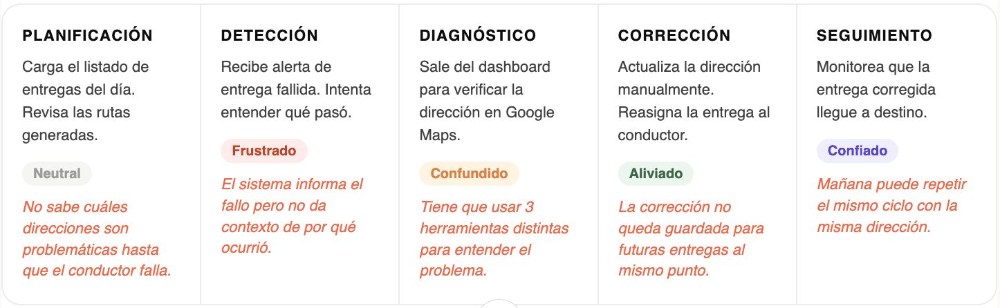
Fleet manager journey
We mapped the manager’s full journey during a day of deliveries with incidents. What we found was that the moments of greatest friction were not on the dashboard itself, but in the bridges between the dashboard and the actions the manager had to take outside of it.
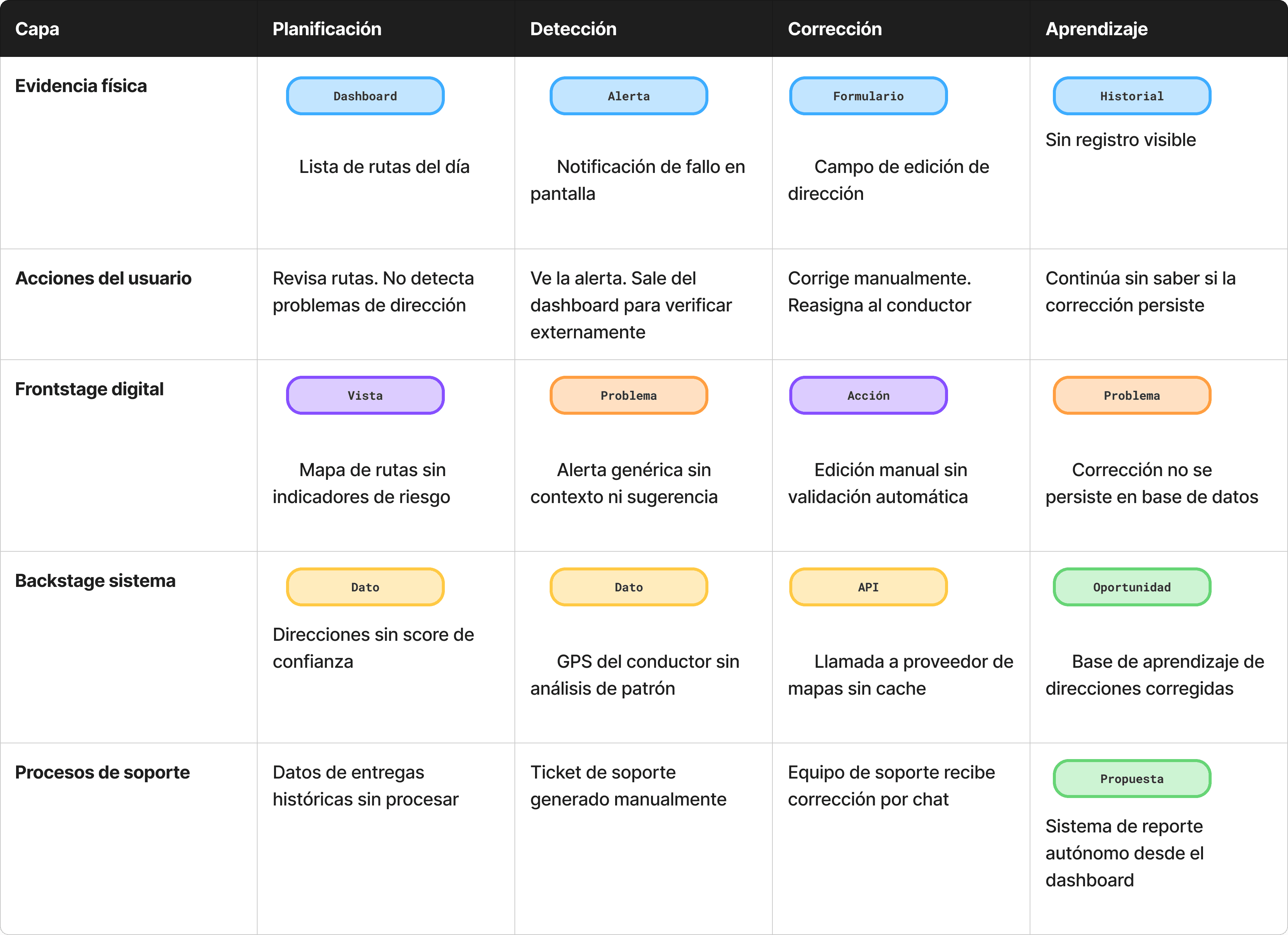
Service Blueprint
The blueprint allowed us to see the full service in a single view: what the manager experiences in the frontend, what happens in the system backstage, and the failure points between both layers. This revealed that the problem of incorrect addresses was a systems problem, not a surface-level UX problem.


Results
+35%Reduction in incident resolution time | 98%Satisfaction in contract renewal |
|---|---|
+18%Improvement in completed delivery rate | −12%Support tickets for address errors |
My process
Entrevistas con gestores y análisis de tickets
Empecé por entender el trabajo real del gestor de flota, no el trabajo ideal. Hice entrevistas contextuales mientras usaban el dashboard en vivo. Paralelamente, analicé los tickets de soporte de los últimos 3 meses para identificar los patrones de fallo más frecuentes. El 40% de los tickets tenían relación con direcciones incorrectas. Ese fue el punto de entrada.
Construcción del Service Blueprint
Mapeé el servicio completo en un blueprint: las acciones del gestor, lo que ve en el frontstage digital, lo que ocurre en el backstage del sistema y los procesos de soporte que sostenían los huecos del producto. Ese ejercicio reveló que el problema de las direcciones no era un bug de UI, era un problema de arquitectura de datos sin resolver en el backstage.
Definición de oportunidades de diseño
Del blueprint surgieron tres oportunidades concretas: mostrar un score de confianza por dirección antes de iniciar la ruta, integrar la corrección de direcciones dentro del dashboard sin salir a herramientas externas, y persistir las correcciones como aprendizaje del sistema. Cada oportunidad tenía un impacto distinto: la primera era de prevención, la segunda de eficiencia, la tercera de inteligencia acumulada.
Diseño de la solución en Figma
Diseñé tres features integradas: un indicador de riesgo por dirección en la vista de planificación, un flujo de corrección inline con validación automática vía API de mapas, y un panel de "direcciones frecuentes corregidas" que permitía al gestor gestionar el conocimiento acumulado del sistema. Cada feature se prototipó y validó con gestores reales antes de pasar a desarrollo.
Validación con usuarios y ajuste
Hicimos dos rondas de testing con gestores. La primera reveló que el score de riesgo necesitaba ser más explícito: los usuarios no entendían el número, necesitaban una categoría (bajo, medio, alto). La segunda confirmó que el flujo de corrección inline era viable pero necesitaba un paso de confirmación para evitar errores accidentales. Esos ajustes entraron antes del release.
Key decisions
The most important decision was to treat the address problem as a service problem, not a UI problem. If we had only improved how errors were displayed, the manager would have kept wasting time correcting them manually. The solution had to address the full cycle: detect, correct, and learn.
The second decision was not to design for the ideal case. In logistics, something always goes wrong. The dashboard had to be optimized for the incident scenario, not for the perfect day when everything arrives on time. That completely changed the interface priorities: what needed prominence were actionable alerts, not summary metrics.
The dashboard was not failing to inform. It was failing to make action easier. Designing that difference was the real work of the project.
Tools and methods
Figma | Service Blueprint | Prototyping |
|---|---|---|
Journey Mapping | Contextual interviews | Dashboard Design |
Ticket analysis | Usability Testing | Data visualization |
Learnings
The blueprint reveals the invisibleMapping the backstage of the service was what made the real problem visible. Without that exercise, we would have redesigned the interface without solving the root cause. | Design for the bad dayIn operations, the incident case is the normal case. A logistics dashboard has to be optimized for when something fails, not for when everything goes well. |
Tickets are researchAnalyzing support tickets was more revealing than many interviews. They were the honest record of where the service failed, without filters or courtesy bias. | Informing is not enoughA good dashboard does not just show what is happening. It suggests what to do. The difference between data and decisions is design. |

More projects


Service Design
SimpliRoute: redesigning the service behind the dashboard
How I applied service design to understand why the right data wasn't enough to make delivery decisions, and how we redesigned the entire experience from data to action.
Year:
2024
Industry :
Logistics — SaaS
Client:
SimpleRoute
Role :
Service Designer
Context
SimpliRoute is a SaaS logistics optimization platform. Its core product is a dashboard where fleet managers plan routes, monitor deliveries in real time, and make operational decisions that directly affect costs and end-customer satisfaction.
The dashboard had data. Good data. The problem was that users could not turn that data into quick decisions. Whenever something went wrong in a delivery, the manager had to navigate between multiple views, compare information from different sources, and make a decision under time pressure. The system informed, but it did not make action easier.
The problem was not a lack of information. It was the distance between data and action. That is a service problem, not just an interface problem.
The service actors
Before touching any wireframe, we mapped all the actors involved in the delivery service. The dashboard was not used by a single person: it was the intersection point of multiple roles with different and often conflicting needs.
Primary user 👨🏻💼 Fleet managerPlans routes, monitors delivery status, and resolves incidents in real time. High operational pressure. | Secondary user 🚛 DriverCarries out the assigned route. Reports navigation issues from the mobile app. Their data feeds the dashboard. | End customer 📦 RecipientReceives the delivery. Their satisfaction depends on decisions made in the dashboard that they will never see. |
|---|---|---|
Internal stakeholder 📊 Operations managerNeeds performance metrics. Consumes the same data as the manager, but with a completely different logic. | External system 📍 Map providersGoogle Maps, HERE, and others. The quality of their address data directly affects the failed delivery rate. | Support 📱 SimpliRoute teamReceived tickets when managers could not resolve incidents from the dashboard. A proxy for the real pain points. |
The problem from the perspective of the service
40% of delivery issues originated in incorrect or incomplete addresses. But the process for detecting, correcting, and applying those corrections was fragmented across multiple steps, tools, and people. The manager was the link that had to connect all of that manually.
Incorrect addresses generated 50% of planning delays. The manager detected them late, when the driver was already en route and had already lost time. |
|---|
There was no clear workflow for correcting an address. The manager had to leave the dashboard, look up the address in external tools, come back, and update it manually. Each correction took between 3 and 7 minutes. |
Corrections were not retained as learning. If an address was corrected today, it would show up incorrect again tomorrow because there was no mechanism to persist that knowledge in the system. |
The dashboard showed delivery status but did not suggest actions. The manager could see that something was going wrong, but the system did not tell them what to do or in what order. |
Fleet manager journey
We mapped the manager’s full journey during a day of deliveries with incidents. What we found was that the moments of greatest friction were not on the dashboard itself, but in the bridges between the dashboard and the actions the manager had to take outside of it.
Service Blueprint
The blueprint allowed us to see the full service in a single view: what the manager experiences in the frontend, what happens in the system backstage, and the failure points between both layers. This revealed that the problem of incorrect addresses was a systems problem, not a surface-level UX problem.
Results
+35%Reduction in incident resolution time | 98%Satisfaction in contract renewal |
|---|---|
+18%Improvement in completed delivery rate | −12%Support tickets for address errors |
My process
Entrevistas con gestores y análisis de tickets
Empecé por entender el trabajo real del gestor de flota, no el trabajo ideal. Hice entrevistas contextuales mientras usaban el dashboard en vivo. Paralelamente, analicé los tickets de soporte de los últimos 3 meses para identificar los patrones de fallo más frecuentes. El 40% de los tickets tenían relación con direcciones incorrectas. Ese fue el punto de entrada.
Construcción del Service Blueprint
Mapeé el servicio completo en un blueprint: las acciones del gestor, lo que ve en el frontstage digital, lo que ocurre en el backstage del sistema y los procesos de soporte que sostenían los huecos del producto. Ese ejercicio reveló que el problema de las direcciones no era un bug de UI, era un problema de arquitectura de datos sin resolver en el backstage.
Definición de oportunidades de diseño
Del blueprint surgieron tres oportunidades concretas: mostrar un score de confianza por dirección antes de iniciar la ruta, integrar la corrección de direcciones dentro del dashboard sin salir a herramientas externas, y persistir las correcciones como aprendizaje del sistema. Cada oportunidad tenía un impacto distinto: la primera era de prevención, la segunda de eficiencia, la tercera de inteligencia acumulada.
Diseño de la solución en Figma
Diseñé tres features integradas: un indicador de riesgo por dirección en la vista de planificación, un flujo de corrección inline con validación automática vía API de mapas, y un panel de "direcciones frecuentes corregidas" que permitía al gestor gestionar el conocimiento acumulado del sistema. Cada feature se prototipó y validó con gestores reales antes de pasar a desarrollo.
Validación con usuarios y ajuste
Hicimos dos rondas de testing con gestores. La primera reveló que el score de riesgo necesitaba ser más explícito: los usuarios no entendían el número, necesitaban una categoría (bajo, medio, alto). La segunda confirmó que el flujo de corrección inline era viable pero necesitaba un paso de confirmación para evitar errores accidentales. Esos ajustes entraron antes del release.
Key decisions
The most important decision was to treat the address problem as a service problem, not a UI problem. If we had only improved how errors were displayed, the manager would have kept wasting time correcting them manually. The solution had to address the full cycle: detect, correct, and learn.
The second decision was not to design for the ideal case. In logistics, something always goes wrong. The dashboard had to be optimized for the incident scenario, not for the perfect day when everything arrives on time. That completely changed the interface priorities: what needed prominence were actionable alerts, not summary metrics.
The dashboard was not failing to inform. It was failing to make action easier. Designing that difference was the real work of the project.
Tools and methods
Figma | Service Blueprint | Prototyping |
|---|---|---|
Journey Mapping | Contextual interviews | Dashboard Design |
Ticket analysis | Usability Testing | Data visualization |
Learnings
The blueprint reveals the invisibleMapping the backstage of the service was what made the real problem visible. Without that exercise, we would have redesigned the interface without solving the root cause. | Design for the bad dayIn operations, the incident case is the normal case. A logistics dashboard has to be optimized for when something fails, not for when everything goes well. |
Tickets are researchAnalyzing support tickets was more revealing than many interviews. They were the honest record of where the service failed, without filters or courtesy bias. | Informing is not enoughA good dashboard does not just show what is happening. It suggests what to do. The difference between data and decisions is design. |
More projects
Service Design
SimpliRoute: redesigning the service behind the dashboard
How I applied service design to understand why the right data wasn't enough to make delivery decisions, and how we redesigned the entire experience from data to action.
Year:
2024
Industry :
Logistics — SaaS
Client:
SimpleRoute
Role :
Service Designer
Context
SimpliRoute is a SaaS logistics optimization platform. Its core product is a dashboard where fleet managers plan routes, monitor deliveries in real time, and make operational decisions that directly affect costs and end-customer satisfaction.
The dashboard had data. Good data. The problem was that users could not turn that data into quick decisions. Whenever something went wrong in a delivery, the manager had to navigate between multiple views, compare information from different sources, and make a decision under time pressure. The system informed, but it did not make action easier.
The problem was not a lack of information. It was the distance between data and action. That is a service problem, not just an interface problem.
The service actors
Before touching any wireframe, we mapped all the actors involved in the delivery service. The dashboard was not used by a single person: it was the intersection point of multiple roles with different and often conflicting needs.
Primary user 👨🏻💼 Fleet managerPlans routes, monitors delivery status, and resolves incidents in real time. High operational pressure. | Secondary user 🚛 DriverCarries out the assigned route. Reports navigation issues from the mobile app. Their data feeds the dashboard. | End customer 📦 RecipientReceives the delivery. Their satisfaction depends on decisions made in the dashboard that they will never see. |
|---|---|---|
Internal stakeholder 📊 Operations managerNeeds performance metrics. Consumes the same data as the manager, but with a completely different logic. | External system 📍 Map providersGoogle Maps, HERE, and others. The quality of their address data directly affects the failed delivery rate. | Support 📱 SimpliRoute teamReceived tickets when managers could not resolve incidents from the dashboard. A proxy for the real pain points. |
The problem from the perspective of the service
40% of delivery issues originated in incorrect or incomplete addresses. But the process for detecting, correcting, and applying those corrections was fragmented across multiple steps, tools, and people. The manager was the link that had to connect all of that manually.
Incorrect addresses generated 50% of planning delays. The manager detected them late, when the driver was already en route and had already lost time. |
|---|
There was no clear workflow for correcting an address. The manager had to leave the dashboard, look up the address in external tools, come back, and update it manually. Each correction took between 3 and 7 minutes. |
Corrections were not retained as learning. If an address was corrected today, it would show up incorrect again tomorrow because there was no mechanism to persist that knowledge in the system. |
The dashboard showed delivery status but did not suggest actions. The manager could see that something was going wrong, but the system did not tell them what to do or in what order. |
Fleet manager journey
We mapped the manager’s full journey during a day of deliveries with incidents. What we found was that the moments of greatest friction were not on the dashboard itself, but in the bridges between the dashboard and the actions the manager had to take outside of it.
Service Blueprint
The blueprint allowed us to see the full service in a single view: what the manager experiences in the frontend, what happens in the system backstage, and the failure points between both layers. This revealed that the problem of incorrect addresses was a systems problem, not a surface-level UX problem.
Results
+35%Reduction in incident resolution time | 98%Satisfaction in contract renewal |
|---|---|
+18%Improvement in completed delivery rate | −12%Support tickets for address errors |
My process
Entrevistas con gestores y análisis de tickets
Empecé por entender el trabajo real del gestor de flota, no el trabajo ideal. Hice entrevistas contextuales mientras usaban el dashboard en vivo. Paralelamente, analicé los tickets de soporte de los últimos 3 meses para identificar los patrones de fallo más frecuentes. El 40% de los tickets tenían relación con direcciones incorrectas. Ese fue el punto de entrada.
Construcción del Service Blueprint
Mapeé el servicio completo en un blueprint: las acciones del gestor, lo que ve en el frontstage digital, lo que ocurre en el backstage del sistema y los procesos de soporte que sostenían los huecos del producto. Ese ejercicio reveló que el problema de las direcciones no era un bug de UI, era un problema de arquitectura de datos sin resolver en el backstage.
Definición de oportunidades de diseño
Del blueprint surgieron tres oportunidades concretas: mostrar un score de confianza por dirección antes de iniciar la ruta, integrar la corrección de direcciones dentro del dashboard sin salir a herramientas externas, y persistir las correcciones como aprendizaje del sistema. Cada oportunidad tenía un impacto distinto: la primera era de prevención, la segunda de eficiencia, la tercera de inteligencia acumulada.
Diseño de la solución en Figma
Diseñé tres features integradas: un indicador de riesgo por dirección en la vista de planificación, un flujo de corrección inline con validación automática vía API de mapas, y un panel de "direcciones frecuentes corregidas" que permitía al gestor gestionar el conocimiento acumulado del sistema. Cada feature se prototipó y validó con gestores reales antes de pasar a desarrollo.
Validación con usuarios y ajuste
Hicimos dos rondas de testing con gestores. La primera reveló que el score de riesgo necesitaba ser más explícito: los usuarios no entendían el número, necesitaban una categoría (bajo, medio, alto). La segunda confirmó que el flujo de corrección inline era viable pero necesitaba un paso de confirmación para evitar errores accidentales. Esos ajustes entraron antes del release.
Key decisions
The most important decision was to treat the address problem as a service problem, not a UI problem. If we had only improved how errors were displayed, the manager would have kept wasting time correcting them manually. The solution had to address the full cycle: detect, correct, and learn.
The second decision was not to design for the ideal case. In logistics, something always goes wrong. The dashboard had to be optimized for the incident scenario, not for the perfect day when everything arrives on time. That completely changed the interface priorities: what needed prominence were actionable alerts, not summary metrics.
The dashboard was not failing to inform. It was failing to make action easier. Designing that difference was the real work of the project.
Tools and methods
Figma | Service Blueprint | Prototyping |
|---|---|---|
Journey Mapping | Contextual interviews | Dashboard Design |
Ticket analysis | Usability Testing | Data visualization |
Learnings
The blueprint reveals the invisibleMapping the backstage of the service was what made the real problem visible. Without that exercise, we would have redesigned the interface without solving the root cause. | Design for the bad dayIn operations, the incident case is the normal case. A logistics dashboard has to be optimized for when something fails, not for when everything goes well. |
Tickets are researchAnalyzing support tickets was more revealing than many interviews. They were the honest record of where the service failed, without filters or courtesy bias. | Informing is not enoughA good dashboard does not just show what is happening. It suggests what to do. The difference between data and decisions is design. |