UI / UX Design
Betterfly App: B2C and B2B Product Design
How we design the end-to-end experience in a corporate wellness platform: from end-user onboarding to the management portal for client companies.
Year:
2023-2024
Industry :
Wellness & InsurTech
Client:
Betterfly
Role :
Product Designer

Context
Betterfly is a corporate wellness platform that turns healthy habits into donations to social causes. The model works in two layers: employees use the app to record their habits and accumulate impact, while client companies manage their benefits and report metrics from a dedicated web portal.
I was part of the design team at a key moment: the platform was growing rapidly in LATAM and needed to mature on both fronts at the same time. My work covered both the end-user experience in the app and that of the corporate administrator in the B2B portal.

The problem
The product had traction but presented significant friction at the entry points of both flows. In the app, the onboarding did not clearly communicate Betterfly's differentiating value. Many users arrived, signed up, and did not understand why their habits mattered beyond themselves.
In the B2B portal, company administrators had difficulty configuring benefits and reading reports. The interface was functional but not guided, which created dependence on the support team for basic tasks.
App onboarding did not convey the social impact purpose from the first use, which affected early activation. |
|---|
The gamification flows (Node, Journey) did not have a coherent narrative. Users did not understand the difference between one and the other. |
The B2B portal lacked visual hierarchy. Administrators did not know where to start when entering for the first time. |
Both platforms needed to scale to new markets without a consolidated component guide. |
Results
32%Improvement in end-user CSAT | -30%Support tickets in B2B portal |
|---|---|
-62%Activation time in onboarding | 20%Adoption of new features |


Research
Before proposing any solution, the team carried out a research phase with both user profiles. For the app, we conducted interviews with employees from Chile, Brazil, and Colombia. For the portal, we held sessions with HR administrators from client companies.
The findings were different on each front. In B2C, the problem was emotional: users did not connect with the concept of impact. In B2B, it was cognitive: there was too much information without prioritization, and the configuration flows did not have a clear start-to-finish logic.
The same product, two completely different problems. The solution had to be different in each case.
We also analyzed the competition in corporate wellness and found that no similar platform explicitly connected individual use with collective impact. That insight was what guided the direction of the onboarding redesign.
My process
Mapeo de flujos existentes
Audité los flujos actuales de la app y el portal para identificar puntos de abandono y fricción. Trabajé junto al equipo de producto para cruzar los datos de analytics con los hallazgos cualitativos del research. Eso nos permitió priorizar qué atacar primero en cada plataforma.
Rediseño del onboarding B2C
Rediseñé el flujo de onboarding para que el concepto de impacto apareciera en el momento cero, no después de que el usuario ya había perdido el interés. Propuse una secuencia de 3 pantallas que conectaba el hábito del usuario con una causa social concreta antes de pedirle que se registrara. Lo validamos con usuarios reales y ajustamos el copy y el orden de los pasos.
Diseño de features: Nodo y Journey
Trabajé en el diseño de dos features clave de la app. Nodo era un espacio social donde los usuarios podían ver el impacto colectivo de su empresa. Journey era un módulo de retos personales. Mi aporte fue clarificar la diferencia narrativa entre ambos y diseñar los componentes visuales que los diferenciaban sin fragmentar la experiencia general de la app.
Rediseño del portal corporativo B2B
Diseñé la arquitectura de información del portal desde cero. Definí la jerarquía de navegación, los flujos de configuración de beneficios y el sistema de reportes. El objetivo era que un administrador nuevo pudiera completar las tareas principales sin necesitar soporte. Esto lo hice en colaboración con el equipo de customer success, que nos proveyó los pain points más frecuentes.
Sistema de componentes compartido
Una parte importante de mi trabajo fue asegurar coherencia visual entre la app y el portal. Construí una librería de componentes en Figma que los dos productos podían usar como base, adaptando las variantes para web y mobile. Esto redujo el tiempo de diseño en sprints posteriores y le dio al equipo de desarrollo una referencia clara.
Testing y lanzamiento
Coordiné rondas de testing con usuarios de ambos perfiles antes del lanzamiento. Los cambios del onboarding se probaron con un grupo reducido antes del rollout general. En el portal, hicimos sesiones de prueba con administradores reales de empresas clientes para validar los flujos de configuración.
What I designed in each area
Mobile app — employee experience (B2C)
Purpose-driven onboarding | Node — collective impact |
|---|---|
Activation flow redesigned to connect personal habit with social impact from the very first screen. | A social space where the user sees how their activity contributes to their company's impact in real time. |
Journey — personal challenges | Habit dashboard |
Individual challenge module with progress and reward mechanics to sustain motivation. | Main view redesigned to give prominence to accumulated impact, not just health metrics. |
Corporate portal — administrator experience (B2B)
Information architecture | Benefits configuration |
|---|---|
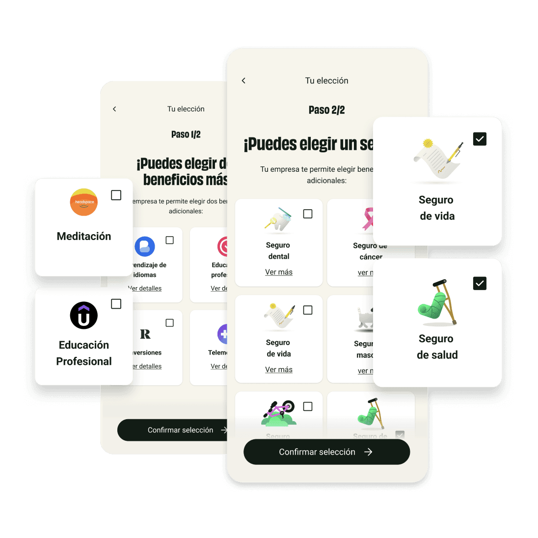
New navigation structure that prioritizes the HR administrator's most frequent tasks. | Step-by-step flow to activate and manage wellness plans without relying on the support team. |
Adoption reports | User management |
Metrics dashboard redesigned with a clear hierarchy: key data first, then detail. | Module for adding, editing, and managing employees with clear states and contextual actions. |
Key design decisions
In the app, the most important decision was to put impact before registration. It was a risk because it added one more screen to the flow. But the hypothesis was that a user who already understood the "why" would be more likely to complete onboarding. The data confirmed it.
In the portal, I decided to simplify the main navigation to a maximum of five sections and remove secondary actions from the main view. We discussed it with the product and customer success team because it meant hiding features that some clients used. The decision was correct: support tickets went down and autonomous navigation increased.
Designing for two very different user profiles in the same product teaches you to prioritize with judgment, not intuition.
The shared component system was a technical decision with direct business impact. By unifying the library, subsequent design sprints were faster and inconsistencies between platforms disappeared. It was work I did in parallel with feature design, but it benefited the team long term.
Learnings
B2B and B2C are different languages | Activate before explaining |
|---|---|
The employee needs emotion and purpose. The administrator needs clarity and control. The same design doesn't work for both. | Showing the product's value before asking for data was the decision that moved the needle most in onboarding. The user needs to understand the "why" first. |
Systems scale, screens don't | Customer success is research |
Investing time in building a shared component library was the decision that delivered the most long-term benefit, even though at first it seemed like low-impact work. | The pain points brought by the support team were more precise than many interview sessions. I learned to include them in the process from the start. |

More projects


UI / UX Design
Betterfly App: B2C and B2B Product Design
How we design the end-to-end experience in a corporate wellness platform: from end-user onboarding to the management portal for client companies.
Year:
2023-2024
Industry :
Wellness & InsurTech
Client:
Betterfly
Role :
Product Designer
Context
Betterfly is a corporate wellness platform that turns healthy habits into donations to social causes. The model works in two layers: employees use the app to record their habits and accumulate impact, while client companies manage their benefits and report metrics from a dedicated web portal.
I was part of the design team at a key moment: the platform was growing rapidly in LATAM and needed to mature on both fronts at the same time. My work covered both the end-user experience in the app and that of the corporate administrator in the B2B portal.
The problem
The product had traction but presented significant friction at the entry points of both flows. In the app, the onboarding did not clearly communicate Betterfly's differentiating value. Many users arrived, signed up, and did not understand why their habits mattered beyond themselves.
In the B2B portal, company administrators had difficulty configuring benefits and reading reports. The interface was functional but not guided, which created dependence on the support team for basic tasks.
App onboarding did not convey the social impact purpose from the first use, which affected early activation. |
|---|
The gamification flows (Node, Journey) did not have a coherent narrative. Users did not understand the difference between one and the other. |
The B2B portal lacked visual hierarchy. Administrators did not know where to start when entering for the first time. |
Both platforms needed to scale to new markets without a consolidated component guide. |
Results
32%Improvement in end-user CSAT | -30%Support tickets in B2B portal |
|---|---|
-62%Activation time in onboarding | 20%Adoption of new features |
Research
Before proposing any solution, the team carried out a research phase with both user profiles. For the app, we conducted interviews with employees from Chile, Brazil, and Colombia. For the portal, we held sessions with HR administrators from client companies.
The findings were different on each front. In B2C, the problem was emotional: users did not connect with the concept of impact. In B2B, it was cognitive: there was too much information without prioritization, and the configuration flows did not have a clear start-to-finish logic.
The same product, two completely different problems. The solution had to be different in each case.
We also analyzed the competition in corporate wellness and found that no similar platform explicitly connected individual use with collective impact. That insight was what guided the direction of the onboarding redesign.
My process
Mapeo de flujos existentes
Audité los flujos actuales de la app y el portal para identificar puntos de abandono y fricción. Trabajé junto al equipo de producto para cruzar los datos de analytics con los hallazgos cualitativos del research. Eso nos permitió priorizar qué atacar primero en cada plataforma.
Rediseño del onboarding B2C
Rediseñé el flujo de onboarding para que el concepto de impacto apareciera en el momento cero, no después de que el usuario ya había perdido el interés. Propuse una secuencia de 3 pantallas que conectaba el hábito del usuario con una causa social concreta antes de pedirle que se registrara. Lo validamos con usuarios reales y ajustamos el copy y el orden de los pasos.
Diseño de features: Nodo y Journey
Trabajé en el diseño de dos features clave de la app. Nodo era un espacio social donde los usuarios podían ver el impacto colectivo de su empresa. Journey era un módulo de retos personales. Mi aporte fue clarificar la diferencia narrativa entre ambos y diseñar los componentes visuales que los diferenciaban sin fragmentar la experiencia general de la app.
Rediseño del portal corporativo B2B
Diseñé la arquitectura de información del portal desde cero. Definí la jerarquía de navegación, los flujos de configuración de beneficios y el sistema de reportes. El objetivo era que un administrador nuevo pudiera completar las tareas principales sin necesitar soporte. Esto lo hice en colaboración con el equipo de customer success, que nos proveyó los pain points más frecuentes.
Sistema de componentes compartido
Una parte importante de mi trabajo fue asegurar coherencia visual entre la app y el portal. Construí una librería de componentes en Figma que los dos productos podían usar como base, adaptando las variantes para web y mobile. Esto redujo el tiempo de diseño en sprints posteriores y le dio al equipo de desarrollo una referencia clara.
Testing y lanzamiento
Coordiné rondas de testing con usuarios de ambos perfiles antes del lanzamiento. Los cambios del onboarding se probaron con un grupo reducido antes del rollout general. En el portal, hicimos sesiones de prueba con administradores reales de empresas clientes para validar los flujos de configuración.
What I designed in each area
Mobile app — employee experience (B2C)
Purpose-driven onboarding | Node — collective impact |
|---|---|
Activation flow redesigned to connect personal habit with social impact from the very first screen. | A social space where the user sees how their activity contributes to their company's impact in real time. |
Journey — personal challenges | Habit dashboard |
Individual challenge module with progress and reward mechanics to sustain motivation. | Main view redesigned to give prominence to accumulated impact, not just health metrics. |
Corporate portal — administrator experience (B2B)
Information architecture | Benefits configuration |
|---|---|
New navigation structure that prioritizes the HR administrator's most frequent tasks. | Step-by-step flow to activate and manage wellness plans without relying on the support team. |
Adoption reports | User management |
Metrics dashboard redesigned with a clear hierarchy: key data first, then detail. | Module for adding, editing, and managing employees with clear states and contextual actions. |
Key design decisions
In the app, the most important decision was to put impact before registration. It was a risk because it added one more screen to the flow. But the hypothesis was that a user who already understood the "why" would be more likely to complete onboarding. The data confirmed it.
In the portal, I decided to simplify the main navigation to a maximum of five sections and remove secondary actions from the main view. We discussed it with the product and customer success team because it meant hiding features that some clients used. The decision was correct: support tickets went down and autonomous navigation increased.
Designing for two very different user profiles in the same product teaches you to prioritize with judgment, not intuition.
The shared component system was a technical decision with direct business impact. By unifying the library, subsequent design sprints were faster and inconsistencies between platforms disappeared. It was work I did in parallel with feature design, but it benefited the team long term.
Learnings
B2B and B2C are different languages | Activate before explaining |
|---|---|
The employee needs emotion and purpose. The administrator needs clarity and control. The same design doesn't work for both. | Showing the product's value before asking for data was the decision that moved the needle most in onboarding. The user needs to understand the "why" first. |
Systems scale, screens don't | Customer success is research |
Investing time in building a shared component library was the decision that delivered the most long-term benefit, even though at first it seemed like low-impact work. | The pain points brought by the support team were more precise than many interview sessions. I learned to include them in the process from the start. |
More projects
UI / UX Design
Betterfly App: B2C and B2B Product Design
How we design the end-to-end experience in a corporate wellness platform: from end-user onboarding to the management portal for client companies.
Year:
2023-2024
Industry :
Wellness & InsurTech
Client:
Betterfly
Role :
Product Designer
Context
Betterfly is a corporate wellness platform that turns healthy habits into donations to social causes. The model works in two layers: employees use the app to record their habits and accumulate impact, while client companies manage their benefits and report metrics from a dedicated web portal.
I was part of the design team at a key moment: the platform was growing rapidly in LATAM and needed to mature on both fronts at the same time. My work covered both the end-user experience in the app and that of the corporate administrator in the B2B portal.
The problem
The product had traction but presented significant friction at the entry points of both flows. In the app, the onboarding did not clearly communicate Betterfly's differentiating value. Many users arrived, signed up, and did not understand why their habits mattered beyond themselves.
In the B2B portal, company administrators had difficulty configuring benefits and reading reports. The interface was functional but not guided, which created dependence on the support team for basic tasks.
App onboarding did not convey the social impact purpose from the first use, which affected early activation. |
|---|
The gamification flows (Node, Journey) did not have a coherent narrative. Users did not understand the difference between one and the other. |
The B2B portal lacked visual hierarchy. Administrators did not know where to start when entering for the first time. |
Both platforms needed to scale to new markets without a consolidated component guide. |
Results
32%Improvement in end-user CSAT | -30%Support tickets in B2B portal |
|---|---|
-62%Activation time in onboarding | 20%Adoption of new features |
Research
Before proposing any solution, the team carried out a research phase with both user profiles. For the app, we conducted interviews with employees from Chile, Brazil, and Colombia. For the portal, we held sessions with HR administrators from client companies.
The findings were different on each front. In B2C, the problem was emotional: users did not connect with the concept of impact. In B2B, it was cognitive: there was too much information without prioritization, and the configuration flows did not have a clear start-to-finish logic.
The same product, two completely different problems. The solution had to be different in each case.
We also analyzed the competition in corporate wellness and found that no similar platform explicitly connected individual use with collective impact. That insight was what guided the direction of the onboarding redesign.
My process
Mapeo de flujos existentes
Audité los flujos actuales de la app y el portal para identificar puntos de abandono y fricción. Trabajé junto al equipo de producto para cruzar los datos de analytics con los hallazgos cualitativos del research. Eso nos permitió priorizar qué atacar primero en cada plataforma.
Rediseño del onboarding B2C
Rediseñé el flujo de onboarding para que el concepto de impacto apareciera en el momento cero, no después de que el usuario ya había perdido el interés. Propuse una secuencia de 3 pantallas que conectaba el hábito del usuario con una causa social concreta antes de pedirle que se registrara. Lo validamos con usuarios reales y ajustamos el copy y el orden de los pasos.
Diseño de features: Nodo y Journey
Trabajé en el diseño de dos features clave de la app. Nodo era un espacio social donde los usuarios podían ver el impacto colectivo de su empresa. Journey era un módulo de retos personales. Mi aporte fue clarificar la diferencia narrativa entre ambos y diseñar los componentes visuales que los diferenciaban sin fragmentar la experiencia general de la app.
Rediseño del portal corporativo B2B
Diseñé la arquitectura de información del portal desde cero. Definí la jerarquía de navegación, los flujos de configuración de beneficios y el sistema de reportes. El objetivo era que un administrador nuevo pudiera completar las tareas principales sin necesitar soporte. Esto lo hice en colaboración con el equipo de customer success, que nos proveyó los pain points más frecuentes.
Sistema de componentes compartido
Una parte importante de mi trabajo fue asegurar coherencia visual entre la app y el portal. Construí una librería de componentes en Figma que los dos productos podían usar como base, adaptando las variantes para web y mobile. Esto redujo el tiempo de diseño en sprints posteriores y le dio al equipo de desarrollo una referencia clara.
Testing y lanzamiento
Coordiné rondas de testing con usuarios de ambos perfiles antes del lanzamiento. Los cambios del onboarding se probaron con un grupo reducido antes del rollout general. En el portal, hicimos sesiones de prueba con administradores reales de empresas clientes para validar los flujos de configuración.
What I designed in each area
Mobile app — employee experience (B2C)
Purpose-driven onboarding | Node — collective impact |
|---|---|
Activation flow redesigned to connect personal habit with social impact from the very first screen. | A social space where the user sees how their activity contributes to their company's impact in real time. |
Journey — personal challenges | Habit dashboard |
Individual challenge module with progress and reward mechanics to sustain motivation. | Main view redesigned to give prominence to accumulated impact, not just health metrics. |
Corporate portal — administrator experience (B2B)
Information architecture | Benefits configuration |
|---|---|
New navigation structure that prioritizes the HR administrator's most frequent tasks. | Step-by-step flow to activate and manage wellness plans without relying on the support team. |
Adoption reports | User management |
Metrics dashboard redesigned with a clear hierarchy: key data first, then detail. | Module for adding, editing, and managing employees with clear states and contextual actions. |
Key design decisions
In the app, the most important decision was to put impact before registration. It was a risk because it added one more screen to the flow. But the hypothesis was that a user who already understood the "why" would be more likely to complete onboarding. The data confirmed it.
In the portal, I decided to simplify the main navigation to a maximum of five sections and remove secondary actions from the main view. We discussed it with the product and customer success team because it meant hiding features that some clients used. The decision was correct: support tickets went down and autonomous navigation increased.
Designing for two very different user profiles in the same product teaches you to prioritize with judgment, not intuition.
The shared component system was a technical decision with direct business impact. By unifying the library, subsequent design sprints were faster and inconsistencies between platforms disappeared. It was work I did in parallel with feature design, but it benefited the team long term.
Learnings
B2B and B2C are different languages | Activate before explaining |
|---|---|
The employee needs emotion and purpose. The administrator needs clarity and control. The same design doesn't work for both. | Showing the product's value before asking for data was the decision that moved the needle most in onboarding. The user needs to understand the "why" first. |
Systems scale, screens don't | Customer success is research |
Investing time in building a shared component library was the decision that delivered the most long-term benefit, even though at first it seemed like low-impact work. | The pain points brought by the support team were more precise than many interview sessions. I learned to include them in the process from the start. |