UI / UX Design
WOM Fiber: designing a product that didn’t exist
How I built WOM’s digital presence in fixed internet from scratch — landing page and customer portal — for a challenger that had just entered a market where competitors had been around for decades.
Year:
2019-2020
Industry :
Telecommunications
Client:
WOM Chile
Role :
Product Designer UX/UI

Context: WOM enters fixed internet
WOM arrived in Chile in 2015 by buying Nextel and revolutionized the mobile phone market with disruptive prices and aggressive campaigns. In five years, it reached almost 5 million mobile customers. But in 2019, something different began: a quiet fiber-optic pilot in Ñuñoa.
In February 2021, WOM officially launched its fiber-optic service with 30,000 customers already active and a reach of 500,000 homes in Santiago and Valparaíso. The differentiator was clear from the start: symmetrical speed, unlimited data with no throttling, and free installation. Prices that left Movistar and VTR with no immediate response.
But having a good product wasn't enough. WOM had no digital presence in fixed internet. There was no landing page, no customer portal, nothing. That was the starting point of this project: to build from scratch the entire digital experience of a product that had just been born.
WOM had the product. We had to build everything else: the digital experience that would make it real for the user
I was part of the design team that worked on two fronts simultaneously: the landing page to attract new customers and the customer portal to manage their service once subscribed. Two different products, but with the same common thread: building trust at every touchpoint.
The market where WOM landed
The fixed internet market in Chile had established players with decades of experience. To design the right experience, we analyzed how each one communicated its value proposition and what the user expected when arriving at a fixed internet landing page.
Movistar (Market leader) More than 45% of the FTTH market. Mature but conservative digital experience. Premium price. | VTR (Cable + fiber) Extensive cable infrastructure. Slow migration to fiber. Landing page oriented toward bundles with TV. | Entel (Growing) Strong in mobile, growing in fixed. More modern digital design than the historical leaders. | WOM Fiber (Newcomer · 0→1) No digital presence in fixed internet. Lowest price in the market. Symmetric speed as the unique differentiator. |
|---|
Two products, one goal
Landing page (Acquisition) | Customer portal (Retention) |
|---|---|
For users who have never had WOM Fiber. The goal was to turn skepticism into a subscription. Every section had to answer an unspoken objection from the potential user. | For active customers. The goal was for them to manage their plan, bills, and service without calling support. A useful portal was the first real proof that WOM Fiber worked. |

The problem of designing from scratch
Having nothing in place beforehand seemed like an advantage: no design debt, no legacy systems. But it also meant having no reference point, no user behavior data, and no established patterns for how Chileans used fixed internet self-service.
No user history. There were no data on how the WOM Fibra customer behaved because the product was new. We had to build the design hypotheses from research with competitor users. |
|---|
The WOM brand was associated with disruptive mobile service, not with the reliability that home internet requires. There was a perception gap that the design had to close from the very first screen. |
Coverage was limited in 2020. WOM Fibra did not reach every municipality. The design had to manage the expectations of the user who arrives interested but discovers that it is not yet available in their area. |
The customer portal started from scratch with users coming from competitor experiences. It had to be as good as the best they had seen, from day one. |
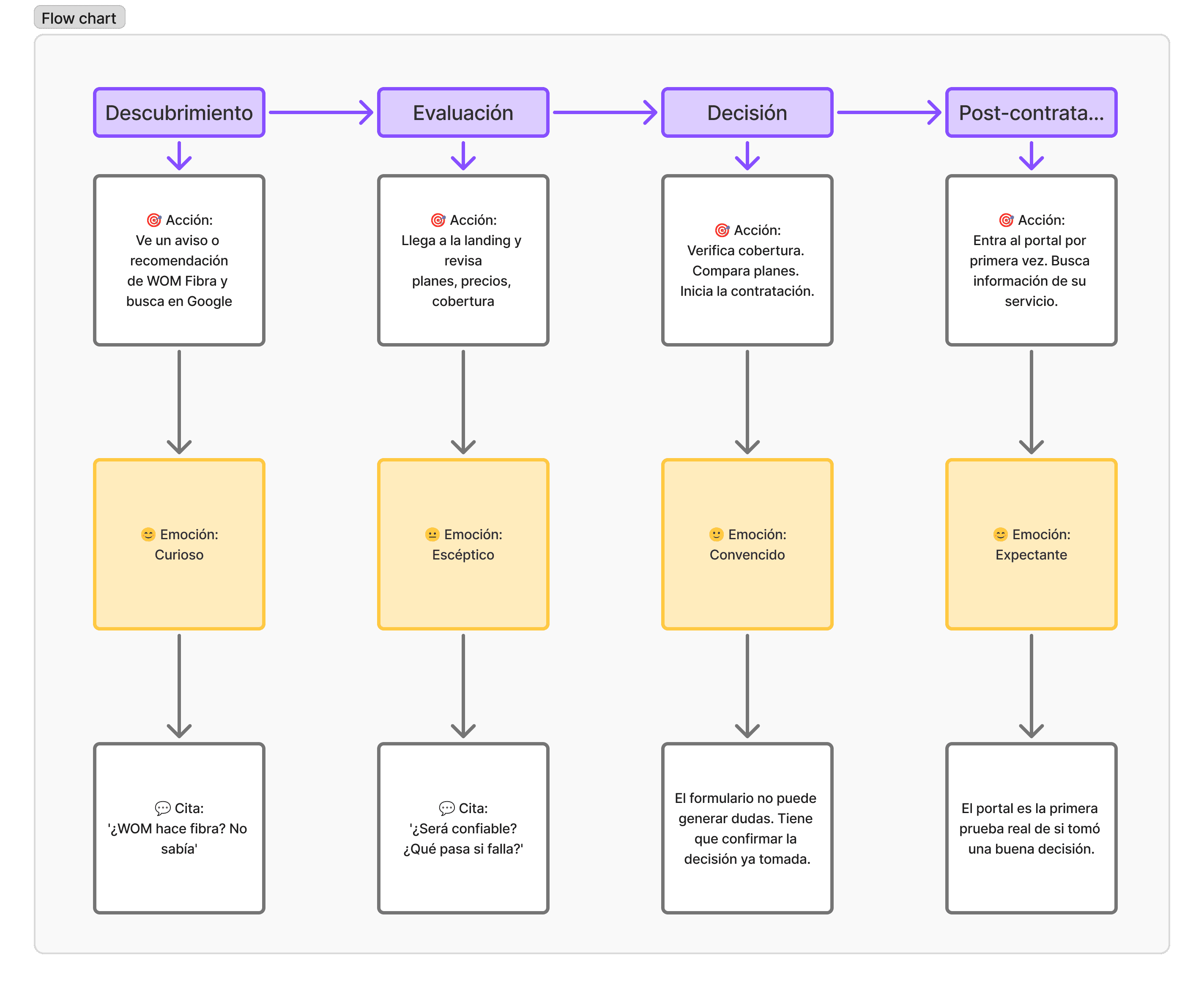
Potential user journey
Without our own data, we mapped the journey with competitor users who had switched or were considering switching fixed internet providers. The most important pattern: abandonment did not happen at the form. It happened much earlier, at the moment when the user could not find enough evidence to trust a new brand.
The landing page as a sequence of trust
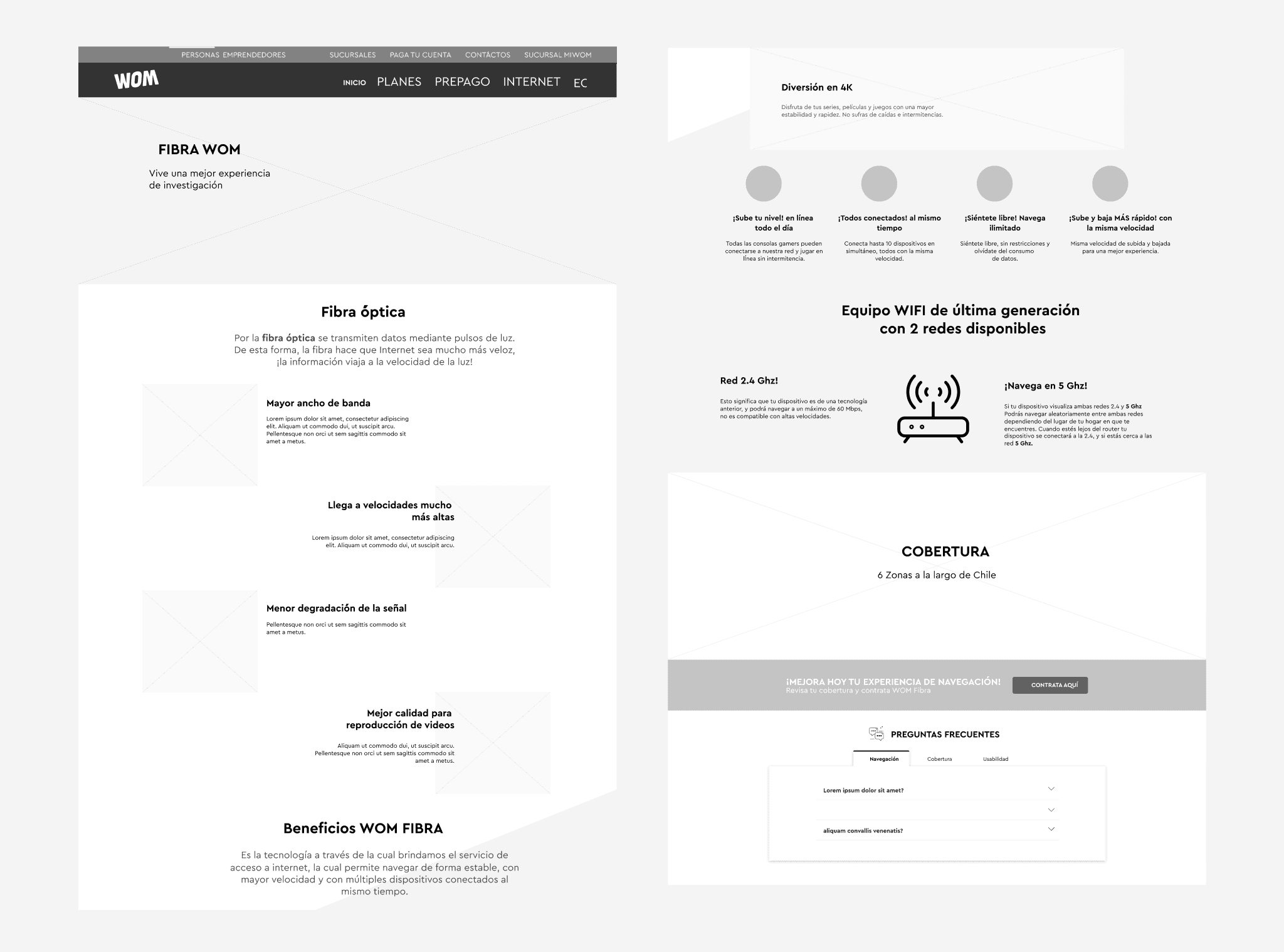
I designed the landing page as a structured conversation, not as a product catalog. The order of the sections followed the logic of what a skeptical user needs to hear before committing. Each section had a specific job.


Results
+35%Reduction in transfer time | 58%Satisfaction with new acquisitions |
|---|---|
+98%Active users in the portal | −42%Support calls for basic questions |
My process
Research sin datos propios
Como no había historial de usuario de WOM Fibra, hice entrevistas con clientes actuales de Movistar y VTR que estaban evaluando cambiar de proveedor. El objetivo era entender qué los hacía dudar y qué los convencía. También analicé las landing pages de los cuatro competidores principales para mapear los patrones del mercado y los elementos de confianza que los usuarios ya esperaban.
Definición de la arquitectura de contenido
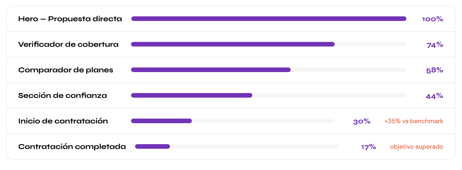
Antes de diseñar una sola pantalla, definí qué tenía que decir cada sección y en qué orden. La landing no era un catálogo: era una secuencia de argumentos. Primero la promesa de precio y velocidad. Después la verificación de cobertura como primer acto de bajo compromiso. Luego los planes con lenguaje claro. Después la evidencia de confianza. Y al final el formulario. Ese orden lo validamos con usuarios antes de construir el diseño.
Diseño mobile first
Más del 70% del tráfico llegaba desde móvil. Empecé por ahí. Eso obligó a tomar decisiones de simplificación que beneficiaron también la versión de escritorio: el verificador de cobertura funcionando con el teclado del celular, los planes comparables en pantalla pequeña sin scroll horizontal, el formulario completable cómodamente con el pulgar.

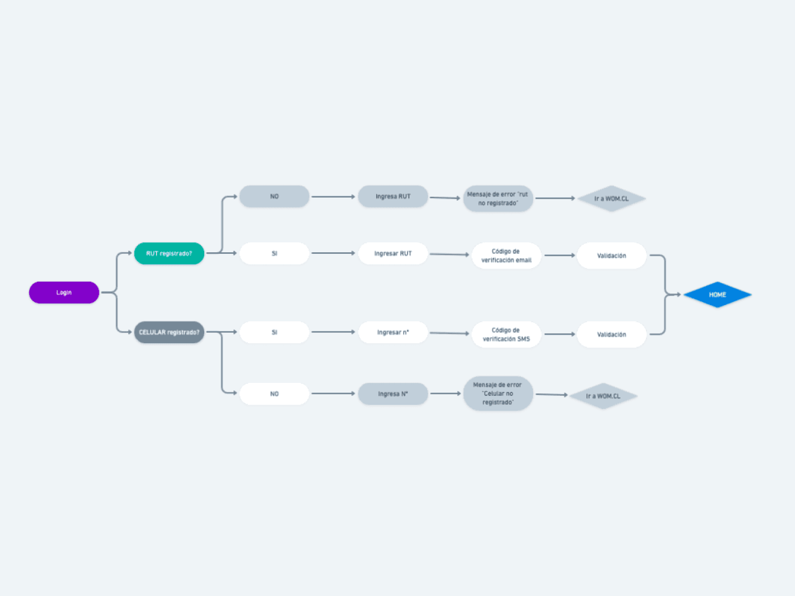
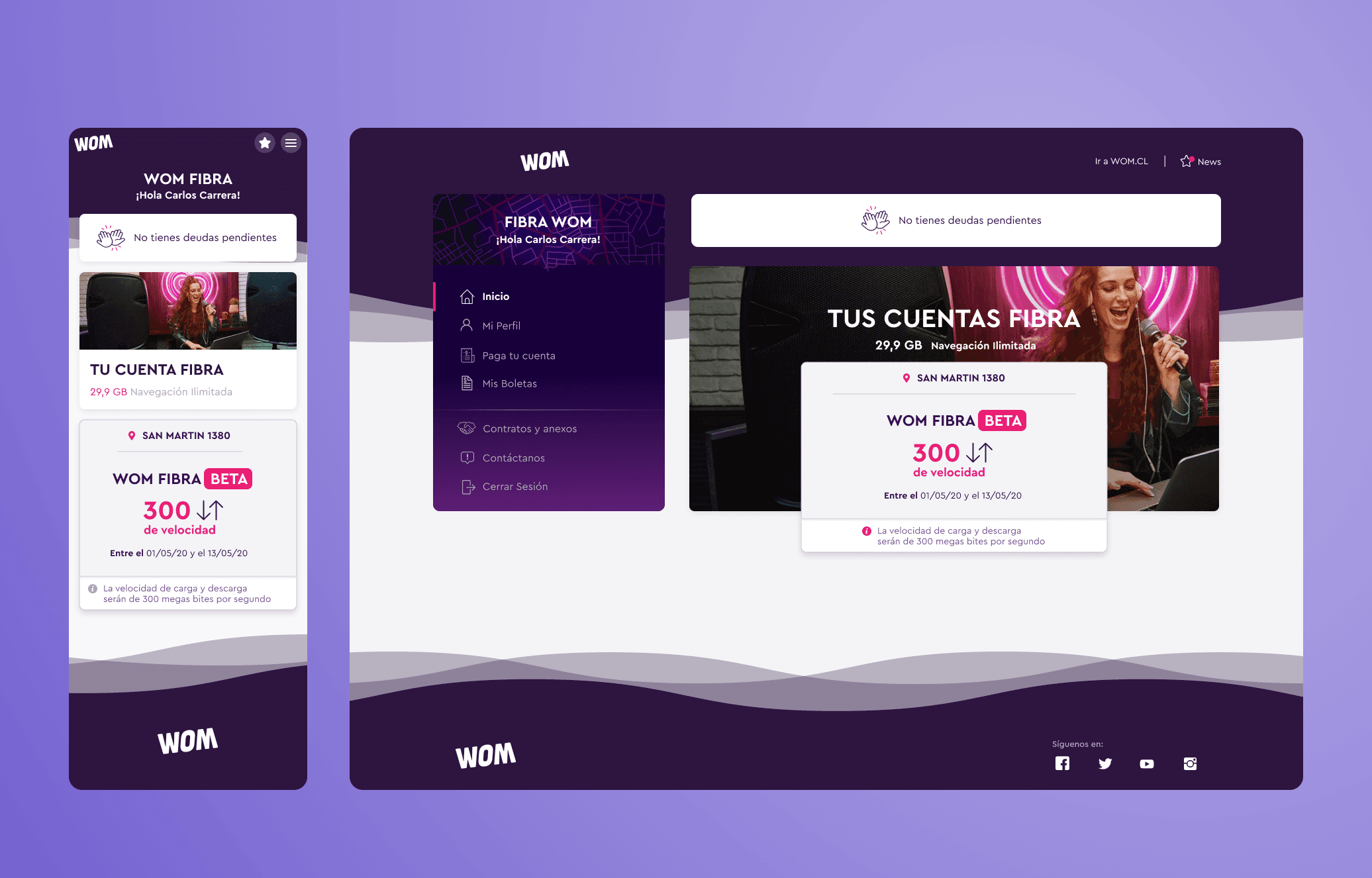
Portal de clientes desde cero
Diseñé la arquitectura de información del portal pensando en las tres tareas más frecuentes: ver el estado de la factura, descargar o pagar, y revisar el plan activo. La home del portal mostraba esas tres cosas sin necesidad de navegar. Todo lo demás estaba organizado pero sin ruido visual. El criterio era: si un cliente necesita llamar al soporte para algo básico, el portal falló.
Testing y validación iterativa
Hicimos dos rondas de testing con usuarios reales. En la primera detectamos que el verificador de cobertura generaba ansiedad cuando la dirección no aparecía: el mensaje de error original parecía un rechazo definitivo. Lo reescribimos como una invitación a registrarse para ser notificado cuando llegara la cobertura. Eso convirtió un punto de frustración en un punto de captación.
What I designed
Coverage checkerFirst hero action. Enter your address and find out in seconds whether WOM Fiber reaches your home. First micro-commitment in the funnel. Error handling turned into lead capture. | Plan comparison toolCards with visual hierarchy. The symmetric speed difference explained with concrete examples: 4K streaming, simultaneous video calls, gaming. No technical jargon. |
|---|---|
Trust sectionBefore the final CTA: verified testimonials, updated coverage numbers, and a satisfaction guarantee. The emotional argument that closes the rational decision. | Step-by-step formSignup split into 4 steps with a progress bar. Each screen asked only for what was needed at that moment. Final step: complete summary before confirming. |
Portal dashboardPortal home with the 3 most frequent actions visible without scrolling: bill, active plan, and contracted speed. No unnecessary navigation for basics. | Bill managementDownloadable history, clear payment status, integrated online payment, and prominent due date. The number one reason for support calls solved in the portal. |
Key design decisions
The most important decision was to use price as the main focus from the very first scroll. In a market where all competitors used fine print prices and asterisks, WOM Fiber had the lowest price. Making it big and clear, with no hidden conditions, was both a design decision and a brand decision. The design had to reflect the honesty promised by the proposition.
The second decision was to turn a coverage error into an opportunity. When the user entered an address with no coverage, the original message was a dead end. We redesigned it as an invitation: "We haven't reached your neighborhood yet, but leave us your email and we'll let you know when we do." That turned a point of abandonment into a waitlist that WOM's sales team actively used to plan expansion.
The best redesign in this project was an error message. Turning it into a lead-generation opportunity completely changed the project's impact.
Learnings
0→1 requires more research, not lessWithout our own data, user research with competitors' users was what replaced the history we didn't have. Research was not optional: it was the only foundation we had. | Errors are designed tooThe coverage checker’s error message was the change with the greatest impact on the project. Negative states are not corners of design: they are opportunities. |
|---|---|
Honest pricing is designShowing the real price with no asterisks was both a brand decision and a UX decision. In a market of fine print, transparency is visual differentiation. | The portal is the promise fulfilledThe landing persuades. The portal confirms. If the portal fails, all the investment in acquisition loses its value. The two products were inseparable. |

More projects


UI / UX Design
WOM Fiber: designing a product that didn’t exist
How I built WOM’s digital presence in fixed internet from scratch — landing page and customer portal — for a challenger that had just entered a market where competitors had been around for decades.
Year:
2019-2020
Industry :
Telecommunications
Client:
WOM Chile
Role :
Product Designer UX/UI
Context: WOM enters fixed internet
WOM arrived in Chile in 2015 by buying Nextel and revolutionized the mobile phone market with disruptive prices and aggressive campaigns. In five years, it reached almost 5 million mobile customers. But in 2019, something different began: a quiet fiber-optic pilot in Ñuñoa.
In February 2021, WOM officially launched its fiber-optic service with 30,000 customers already active and a reach of 500,000 homes in Santiago and Valparaíso. The differentiator was clear from the start: symmetrical speed, unlimited data with no throttling, and free installation. Prices that left Movistar and VTR with no immediate response.
But having a good product wasn't enough. WOM had no digital presence in fixed internet. There was no landing page, no customer portal, nothing. That was the starting point of this project: to build from scratch the entire digital experience of a product that had just been born.
WOM had the product. We had to build everything else: the digital experience that would make it real for the user
I was part of the design team that worked on two fronts simultaneously: the landing page to attract new customers and the customer portal to manage their service once subscribed. Two different products, but with the same common thread: building trust at every touchpoint.
The market where WOM landed
The fixed internet market in Chile had established players with decades of experience. To design the right experience, we analyzed how each one communicated its value proposition and what the user expected when arriving at a fixed internet landing page.
Movistar (Market leader) More than 45% of the FTTH market. Mature but conservative digital experience. Premium price. | VTR (Cable + fiber) Extensive cable infrastructure. Slow migration to fiber. Landing page oriented toward bundles with TV. | Entel (Growing) Strong in mobile, growing in fixed. More modern digital design than the historical leaders. | WOM Fiber (Newcomer · 0→1) No digital presence in fixed internet. Lowest price in the market. Symmetric speed as the unique differentiator. |
|---|
Two products, one goal
Landing page (Acquisition) | Customer portal (Retention) |
|---|---|
For users who have never had WOM Fiber. The goal was to turn skepticism into a subscription. Every section had to answer an unspoken objection from the potential user. | For active customers. The goal was for them to manage their plan, bills, and service without calling support. A useful portal was the first real proof that WOM Fiber worked. |
The problem of designing from scratch
Having nothing in place beforehand seemed like an advantage: no design debt, no legacy systems. But it also meant having no reference point, no user behavior data, and no established patterns for how Chileans used fixed internet self-service.
No user history. There were no data on how the WOM Fibra customer behaved because the product was new. We had to build the design hypotheses from research with competitor users. |
|---|
The WOM brand was associated with disruptive mobile service, not with the reliability that home internet requires. There was a perception gap that the design had to close from the very first screen. |
Coverage was limited in 2020. WOM Fibra did not reach every municipality. The design had to manage the expectations of the user who arrives interested but discovers that it is not yet available in their area. |
The customer portal started from scratch with users coming from competitor experiences. It had to be as good as the best they had seen, from day one. |
Potential user journey
Without our own data, we mapped the journey with competitor users who had switched or were considering switching fixed internet providers. The most important pattern: abandonment did not happen at the form. It happened much earlier, at the moment when the user could not find enough evidence to trust a new brand.
The landing page as a sequence of trust
I designed the landing page as a structured conversation, not as a product catalog. The order of the sections followed the logic of what a skeptical user needs to hear before committing. Each section had a specific job.
Results
+35%Reduction in transfer time | 58%Satisfaction with new acquisitions |
|---|---|
+98%Active users in the portal | −42%Support calls for basic questions |
My process
Research sin datos propios
Como no había historial de usuario de WOM Fibra, hice entrevistas con clientes actuales de Movistar y VTR que estaban evaluando cambiar de proveedor. El objetivo era entender qué los hacía dudar y qué los convencía. También analicé las landing pages de los cuatro competidores principales para mapear los patrones del mercado y los elementos de confianza que los usuarios ya esperaban.
Definición de la arquitectura de contenido
Antes de diseñar una sola pantalla, definí qué tenía que decir cada sección y en qué orden. La landing no era un catálogo: era una secuencia de argumentos. Primero la promesa de precio y velocidad. Después la verificación de cobertura como primer acto de bajo compromiso. Luego los planes con lenguaje claro. Después la evidencia de confianza. Y al final el formulario. Ese orden lo validamos con usuarios antes de construir el diseño.
Diseño mobile first
Más del 70% del tráfico llegaba desde móvil. Empecé por ahí. Eso obligó a tomar decisiones de simplificación que beneficiaron también la versión de escritorio: el verificador de cobertura funcionando con el teclado del celular, los planes comparables en pantalla pequeña sin scroll horizontal, el formulario completable cómodamente con el pulgar.
Portal de clientes desde cero
Diseñé la arquitectura de información del portal pensando en las tres tareas más frecuentes: ver el estado de la factura, descargar o pagar, y revisar el plan activo. La home del portal mostraba esas tres cosas sin necesidad de navegar. Todo lo demás estaba organizado pero sin ruido visual. El criterio era: si un cliente necesita llamar al soporte para algo básico, el portal falló.
Testing y validación iterativa
Hicimos dos rondas de testing con usuarios reales. En la primera detectamos que el verificador de cobertura generaba ansiedad cuando la dirección no aparecía: el mensaje de error original parecía un rechazo definitivo. Lo reescribimos como una invitación a registrarse para ser notificado cuando llegara la cobertura. Eso convirtió un punto de frustración en un punto de captación.
What I designed
Coverage checkerFirst hero action. Enter your address and find out in seconds whether WOM Fiber reaches your home. First micro-commitment in the funnel. Error handling turned into lead capture. | Plan comparison toolCards with visual hierarchy. The symmetric speed difference explained with concrete examples: 4K streaming, simultaneous video calls, gaming. No technical jargon. |
|---|---|
Trust sectionBefore the final CTA: verified testimonials, updated coverage numbers, and a satisfaction guarantee. The emotional argument that closes the rational decision. | Step-by-step formSignup split into 4 steps with a progress bar. Each screen asked only for what was needed at that moment. Final step: complete summary before confirming. |
Portal dashboardPortal home with the 3 most frequent actions visible without scrolling: bill, active plan, and contracted speed. No unnecessary navigation for basics. | Bill managementDownloadable history, clear payment status, integrated online payment, and prominent due date. The number one reason for support calls solved in the portal. |
Key design decisions
The most important decision was to use price as the main focus from the very first scroll. In a market where all competitors used fine print prices and asterisks, WOM Fiber had the lowest price. Making it big and clear, with no hidden conditions, was both a design decision and a brand decision. The design had to reflect the honesty promised by the proposition.
The second decision was to turn a coverage error into an opportunity. When the user entered an address with no coverage, the original message was a dead end. We redesigned it as an invitation: "We haven't reached your neighborhood yet, but leave us your email and we'll let you know when we do." That turned a point of abandonment into a waitlist that WOM's sales team actively used to plan expansion.
The best redesign in this project was an error message. Turning it into a lead-generation opportunity completely changed the project's impact.
Learnings
0→1 requires more research, not lessWithout our own data, user research with competitors' users was what replaced the history we didn't have. Research was not optional: it was the only foundation we had. | Errors are designed tooThe coverage checker’s error message was the change with the greatest impact on the project. Negative states are not corners of design: they are opportunities. |
|---|---|
Honest pricing is designShowing the real price with no asterisks was both a brand decision and a UX decision. In a market of fine print, transparency is visual differentiation. | The portal is the promise fulfilledThe landing persuades. The portal confirms. If the portal fails, all the investment in acquisition loses its value. The two products were inseparable. |
More projects
UI / UX Design
WOM Fiber: designing a product that didn’t exist
How I built WOM’s digital presence in fixed internet from scratch — landing page and customer portal — for a challenger that had just entered a market where competitors had been around for decades.
Year:
2019-2020
Industry :
Telecommunications
Client:
WOM Chile
Role :
Product Designer UX/UI
Context: WOM enters fixed internet
WOM arrived in Chile in 2015 by buying Nextel and revolutionized the mobile phone market with disruptive prices and aggressive campaigns. In five years, it reached almost 5 million mobile customers. But in 2019, something different began: a quiet fiber-optic pilot in Ñuñoa.
In February 2021, WOM officially launched its fiber-optic service with 30,000 customers already active and a reach of 500,000 homes in Santiago and Valparaíso. The differentiator was clear from the start: symmetrical speed, unlimited data with no throttling, and free installation. Prices that left Movistar and VTR with no immediate response.
But having a good product wasn't enough. WOM had no digital presence in fixed internet. There was no landing page, no customer portal, nothing. That was the starting point of this project: to build from scratch the entire digital experience of a product that had just been born.
WOM had the product. We had to build everything else: the digital experience that would make it real for the user
I was part of the design team that worked on two fronts simultaneously: the landing page to attract new customers and the customer portal to manage their service once subscribed. Two different products, but with the same common thread: building trust at every touchpoint.
The market where WOM landed
The fixed internet market in Chile had established players with decades of experience. To design the right experience, we analyzed how each one communicated its value proposition and what the user expected when arriving at a fixed internet landing page.
Movistar (Market leader) More than 45% of the FTTH market. Mature but conservative digital experience. Premium price. | VTR (Cable + fiber) Extensive cable infrastructure. Slow migration to fiber. Landing page oriented toward bundles with TV. | Entel (Growing) Strong in mobile, growing in fixed. More modern digital design than the historical leaders. | WOM Fiber (Newcomer · 0→1) No digital presence in fixed internet. Lowest price in the market. Symmetric speed as the unique differentiator. |
|---|
Two products, one goal
Landing page (Acquisition) | Customer portal (Retention) |
|---|---|
For users who have never had WOM Fiber. The goal was to turn skepticism into a subscription. Every section had to answer an unspoken objection from the potential user. | For active customers. The goal was for them to manage their plan, bills, and service without calling support. A useful portal was the first real proof that WOM Fiber worked. |
The problem of designing from scratch
Having nothing in place beforehand seemed like an advantage: no design debt, no legacy systems. But it also meant having no reference point, no user behavior data, and no established patterns for how Chileans used fixed internet self-service.
No user history. There were no data on how the WOM Fibra customer behaved because the product was new. We had to build the design hypotheses from research with competitor users. |
|---|
The WOM brand was associated with disruptive mobile service, not with the reliability that home internet requires. There was a perception gap that the design had to close from the very first screen. |
Coverage was limited in 2020. WOM Fibra did not reach every municipality. The design had to manage the expectations of the user who arrives interested but discovers that it is not yet available in their area. |
The customer portal started from scratch with users coming from competitor experiences. It had to be as good as the best they had seen, from day one. |
Potential user journey
Without our own data, we mapped the journey with competitor users who had switched or were considering switching fixed internet providers. The most important pattern: abandonment did not happen at the form. It happened much earlier, at the moment when the user could not find enough evidence to trust a new brand.
The landing page as a sequence of trust
I designed the landing page as a structured conversation, not as a product catalog. The order of the sections followed the logic of what a skeptical user needs to hear before committing. Each section had a specific job.
Results
+35%Reduction in transfer time | 58%Satisfaction with new acquisitions |
|---|---|
+98%Active users in the portal | −42%Support calls for basic questions |
My process
Research sin datos propios
Como no había historial de usuario de WOM Fibra, hice entrevistas con clientes actuales de Movistar y VTR que estaban evaluando cambiar de proveedor. El objetivo era entender qué los hacía dudar y qué los convencía. También analicé las landing pages de los cuatro competidores principales para mapear los patrones del mercado y los elementos de confianza que los usuarios ya esperaban.
Definición de la arquitectura de contenido
Antes de diseñar una sola pantalla, definí qué tenía que decir cada sección y en qué orden. La landing no era un catálogo: era una secuencia de argumentos. Primero la promesa de precio y velocidad. Después la verificación de cobertura como primer acto de bajo compromiso. Luego los planes con lenguaje claro. Después la evidencia de confianza. Y al final el formulario. Ese orden lo validamos con usuarios antes de construir el diseño.
Diseño mobile first
Más del 70% del tráfico llegaba desde móvil. Empecé por ahí. Eso obligó a tomar decisiones de simplificación que beneficiaron también la versión de escritorio: el verificador de cobertura funcionando con el teclado del celular, los planes comparables en pantalla pequeña sin scroll horizontal, el formulario completable cómodamente con el pulgar.
Portal de clientes desde cero
Diseñé la arquitectura de información del portal pensando en las tres tareas más frecuentes: ver el estado de la factura, descargar o pagar, y revisar el plan activo. La home del portal mostraba esas tres cosas sin necesidad de navegar. Todo lo demás estaba organizado pero sin ruido visual. El criterio era: si un cliente necesita llamar al soporte para algo básico, el portal falló.
Testing y validación iterativa
Hicimos dos rondas de testing con usuarios reales. En la primera detectamos que el verificador de cobertura generaba ansiedad cuando la dirección no aparecía: el mensaje de error original parecía un rechazo definitivo. Lo reescribimos como una invitación a registrarse para ser notificado cuando llegara la cobertura. Eso convirtió un punto de frustración en un punto de captación.
What I designed
Coverage checkerFirst hero action. Enter your address and find out in seconds whether WOM Fiber reaches your home. First micro-commitment in the funnel. Error handling turned into lead capture. | Plan comparison toolCards with visual hierarchy. The symmetric speed difference explained with concrete examples: 4K streaming, simultaneous video calls, gaming. No technical jargon. |
|---|---|
Trust sectionBefore the final CTA: verified testimonials, updated coverage numbers, and a satisfaction guarantee. The emotional argument that closes the rational decision. | Step-by-step formSignup split into 4 steps with a progress bar. Each screen asked only for what was needed at that moment. Final step: complete summary before confirming. |
Portal dashboardPortal home with the 3 most frequent actions visible without scrolling: bill, active plan, and contracted speed. No unnecessary navigation for basics. | Bill managementDownloadable history, clear payment status, integrated online payment, and prominent due date. The number one reason for support calls solved in the portal. |
Key design decisions
The most important decision was to use price as the main focus from the very first scroll. In a market where all competitors used fine print prices and asterisks, WOM Fiber had the lowest price. Making it big and clear, with no hidden conditions, was both a design decision and a brand decision. The design had to reflect the honesty promised by the proposition.
The second decision was to turn a coverage error into an opportunity. When the user entered an address with no coverage, the original message was a dead end. We redesigned it as an invitation: "We haven't reached your neighborhood yet, but leave us your email and we'll let you know when we do." That turned a point of abandonment into a waitlist that WOM's sales team actively used to plan expansion.
The best redesign in this project was an error message. Turning it into a lead-generation opportunity completely changed the project's impact.
Learnings
0→1 requires more research, not lessWithout our own data, user research with competitors' users was what replaced the history we didn't have. Research was not optional: it was the only foundation we had. | Errors are designed tooThe coverage checker’s error message was the change with the greatest impact on the project. Negative states are not corners of design: they are opportunities. |
|---|---|
Honest pricing is designShowing the real price with no asterisks was both a brand decision and a UX decision. In a market of fine print, transparency is visual differentiation. | The portal is the promise fulfilledThe landing persuades. The portal confirms. If the portal fails, all the investment in acquisition loses its value. The two products were inseparable. |